Saturday 27 December 2008

Inner Body Isometrics

Revista Saude!

http://www.flickr.com/photos/erikaonodera/2497345074/

Love the Isometric Perspective's depticting the inner workings of the body in these editorial spreads. visit erika's other spreads, think this one won an editorial award 2007 but there is the heart.

also check out previous post Visual Body

hope you all had a good christmas.

Wednesday 10 December 2008

Sound Sewing


Design duo Patrick Li and Ian Gallais make up Sounds Butter which has created Visible Sound.

They describe it best:

The intention for this project was to make sound visible. As there is
already a variety of ways in which sounds can be seen (equalizers, sub-titles,
etc.), my aim was to produce a device where that representation of sound would

be a physical one. I therefore used the sewing machine as the basis for the

project as I feel it is synonymous with industry, and making physical

products. Due to limitations in my computer programming skills this model of a

stereo/sewing machine is a prototype of how I imagined the actual product

would look.

More related posts from machine thinking:

Love this project. giving sound a tactile, physical quality. fantastic.

found here: http://machinethinking.org/2008/11/23/visible-sound/

3d Calligram


brilliant. livre is book in french i think. very delicate/intricate stories being visualisaed in 3d calligram thorugh their own narrative in textual form.

very nice text visualisation. ok not necessarily functionable that you can read it, but its form is very good. also check out Mississippi Type Visual.

excellant.

see more images here:

via http://www.villiard.com/livres-art.html ;

from here: carto-infos.googlegroups.com

merci beaucoup Christophe Tricot

Global Internet Map

global internet map - telegeography.com


They've made another. love the circles. and connecting lines.

TeleGeography‘s new Global Internet Map draws upon our annual Global Internet Geography research to provide a unique view of the international Internet networks that link the globe.


The map‘s global projection traces the intercontinental links between the countries of Europe, Asia, North and Latin America, and Africa. Regional close-ups provide insight into key routes within each region. Nine accompanying figures and tables present valuable data on Internet bandwidth by country, regional and global Internet capacity growth, backbone providers, traffic by application, wholesale pricing, and broadband user growth.


The Big Picture


The global projection depicts intercontinental Internet links between the countries of Europe, Asia, North and Latin America, and Africa. higher res (larger) here:

1280x800
1440x900


Their links lines are similiar to those in key magazine cover by John Maeda & world flow.


Find out more: http://visualthinkmap.ning.com/photo/global-internet-map


Their previous internet visuals:


Internet Undersea Map


Other internet visualisations:


Foo Bar - Eboy


Web Trend Map 2008 Beta - Information Architects


Domain Name Map - Hugh Dubberly


Opte Project

Also check out:

Circular Visuals

Monday 1 December 2008

Street Map

bay area - peter ito

I think this was based on GPS but had beautiful colours and layering done recording geographical data over a year. There are others at the flickr link that cover the world and different areas. I particularly like this one.

OpenStreetMap is a free editable map of the whole world. It is made by people like you.

OpenStreetMap allows you to view, edit and use geographical data in a collaborative way from anywhere on Earth.


OpenStreetMap's hosting is kindly supported by the UCL VR Centre and bytemark.

http://www.openstreetmap.org/

found here: http://www.flickr.com/photos/peterito/2969981247/

Sunday 23 November 2008

Cartographic Shapes


this is a great application for facebookm, called Geo Challenge. helps you learn your countries/geography starting off with just the shape and fading in the ajoining/nearby countries to help you realise the paticularly country. they have a round for flags, and cities (usually guessing myself) placing where they are on the world map.

great game and great tool for learning. it helps me with my pathetic knowledge of world geography/cities, although i'm not that bad at flags.


also look at this noisy britain - ben terret excellant post by strange maps.

Sunday 16 November 2008

Cartographic Knowledge

knowledge cartography

Taking into account that I will eventually being able to get my teeth into Information Visualisation: Using Vision to think by card, mackinlay & shneirderman, I thought it would be a great time to post these beauties mapping (structuring) the interrelationships of some of the foremost figures in information graphics, complexity, design, visualization from knowledgecartography.org

These images are screenshots taken from ATLAS, the application that's being developed 'to explore the possibilities of the application of a cartographic metaphor to the realms of knowledge', sort of thinking with maps (cartographic cognition), a form of visual thinking.

'The concept of atlas in this context doesn’t depict as much a list of maps, but rather a system of representations of space, a communication device aimed at representing complex contexts through the use of many partial overlapping narrations: a network of maps, diagrams, texts and peritexts, combined together to describe the space of research in its multifaceted aspects'.

I like this idea of overlapping narrations such as maps (a kind of geographic terrain styled space, as with these examples), diagrams, text (words layered on top of a space), signs (ok the words are signs but I mean iconic/symbolic, those associated with isometric's/otto neurath).

These overlapping narratives fits well with Neuraths isometric's which were a 'picture language as a helping language into which statements may be from all the normal languages of the earth' and was made to highlight commonality rather than differences. There are some already nice mixtures of these narration tools created with World Wireless Map, and telegeography's work Internet Undersea Map (crow, 2006, p. isotype/section)

These narrations serve as a maps (a communication device's) language which they describe really well as these communication devices being 'a mature representation artefact, aware of its own language and its own rhetoric, equipped with it its own tools, languages, techniques and supports. A model that recovers the narrative abilities of pre-scientific maps and presents itself not as a mere mimetic artefact, but as a poetic and political tool'.

It is excellant that use the terms 'mimetic' & 'artefact' as these associate (connote) nicely by grounding it back into art/design with mimetic a term that arnheim would use describing a social biology of images with the level of detail an image would depict the object in reality, giving us levels of signs with iconic, semi-symbollic & symbollic that brings in the linguistic field associated with saussaures & pierce in Visible Signs by David Crow. Artefact really works well as these communication devices serve as 'research through art and design’, ‘where the end product is an artefact – where the thinking is, so to speak, embodied in the artefact’ (Frayling, 1993/4, p.5). Poetic brings in the wonderful calligrams and concrete poetry depicted and experimented really well here Mississippi Type Visual by andy proehl.

'The map as narration is thus the expression of a communicative purpose. Just like a text, the map makes selections on reality, distorts events, classifies and clarifies the world in order to selections better tell a particular aspect of a territory, an event, a space.' they help to simplify (clarifiy) the complexity of a particular territory, space (which could be data/stats, text
in book, geographic landscape i.e. uk, china, france, the world).

'In this context, the term ‘map’ is a synonym of visual narration of space: a cultural artefact created by an author to describe a space according to an objective.' a tool for the production of meaning that satisfies the map designer, the communication device's designer objective.

‘[O]ne important goal for map designers should be to understand the cognitive processes being used to process spatial information’ this is extremely useful and necessary for map designers in creating maps and the spatial arrangement of the knowledge (Wood & Keller, 1996, p 213).

This is known as Spatial Cognition,

‘Spatial Cognition is concerned with the acquisition, organization, utilization, and revision of knowledge about spatial environments’ (Universität Bremen, 2007, p 1).

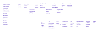
As for the design for these visual maps, communication device examples they have a fabulous soft light blue background with a darker graduation borrowed from relief shading in geographic mapping to depict the the level of focus for the paticular area of field such as Design or Information visualisation. The person's (the iconic isotype/shape of a person) spatial position between the position of these poles/fields gives the viewer/map reader a insight/understanding as the area that that person is likely to be associated with and in turn the particular expertise/slant/view/interests that person might have in their writings when reading.

The use of a clean, un-clustered (white) space lets the user easily focus in on a name they might have a familiarity with for me card, shnierderman, mackinlay, tufte (postiontied between info vis and design, quite rightly), remo burkhard (from vizthink conference recently) who I didn't realize was also inclined towards knowledge, and martin j eppler with his joint creation of Periodic Table of Visualisation Methods.

Atlas is a great tool from knowledge cartography.

Well with this fabulous overview I look forward to some great insights/answers to my research from,


Information Visualisation: Using Vision to Think

Sunday 9 November 2008

World Wireless Map

With the innovation and development of internet 3g enabled mobile phones technology with the fantastic Iphone from apple, it is important that other technology's are there to support it.

When reasearching about internet speeds I learnt more about wireless internet speeds. In the uk I had heard of 3G but I never realised that this represented wireless internet.

Well when i realised that there had been 2G sm (global systems for mobile communication) with a data transfer of 14.4 kbps (kilo bits per sec), worse that dial-up 56 k bps modem, not kilo bytes per sec, read this page for lyberty.com/encyc/articles/kb_kilobytes.html better understanding of data transfer & file size, I soon learnt more.

3G has a data transfer rate of 2 mbps (mega bits per sec), now as I found it a trall trying to find the transfer rates for 2G & 3G I read that not everywhere, especially in america, has 3G wireless access/coverage. Making your Iphone 3G enabled connection pretty slow.

This made me curious as to the possibility of a world map that shows where and what wireless internet connection speeds are available, as there different networks such as 2.5G PRS (32 kbps), HSCSD (57.6 kbps), EDGE (384 kbps) and... there is.

The GSM Association and coveragemaps.com are proud to announce the availability of the updated GSM World Coverage map for 2008. This publication is available in printed form at all GSM Association events and can also be downloaded in PDF using the links below. Unfortunately we are unable to post copies of the map. This maps is updated from time-to-time and new versions can be identified by a change in the colour used for coverage.

Europe has quite a good coverage of 3G connection speeds for your Iphone (depicted in yellow).

Other maps:
<
Find out whether your area has 3G coverage before you invest in an Iphone.

Thursday 6 November 2008

Circular Visuals


by Pedro Monteiro

Great visual by pedro, extremely current and very useful to see just at a glance the sheer increase over time just by their size. the red stands out very well with a minimal black and white structure similar to Once More Around the Sun, with little bits of information giving reasons as to the increase. ceheck out his others here: eco footprints (isometric similar technique to 3D
CV Map
), elections (robert kosara/eager eyes contest, very nice technique/idea), 700billion
& more.


wine flavour wheel by carl tashian
wine
flavour wheel by carl tashian


What is the relationship between wine varieties and flavor components? This visualization attempts to show the strength of these relationships. I culled descriptive flavor words from over 5,000 published wine tasting notes written between 1995-2000 in a major Australian wine magazine. Written by Carl Tashian for Visualizing the Five Senses, a class at http://itp.nyu.edu.

Really great interactive visual, minimal. more here: http://visualthinkmap.ning.com/photo/wine-flavour-wheel-by-carl


great post from info aesthetics by andrew v moere


girltalk by gregg gillis
girltalk
by gregg gillis

girl talk is the DJ name for gregg gillis and is great visual using colour to distinguish the different songs and layers of tracks that he mixes up along a neat circular timeline covering his slot. think there are sites that let you cut up tracks, will me check... www.splicemusic.com and there is the BBC music cubes, lets you build up your favourite tracks but not splice i think.

anyhow great visual with the artists faces jumping off for a bit of ease of
recognition.

think i saw it posted by randy k/coolinfographics.blogspot (sorry would post
hyperlink but need to dash to shop)

Also check out these (some previously posted)

love will tear us apart type by peter crnokrak / A_B_peace & terror by peter crnokrak posted here: Joy, Love, War, Peace

Languages Visual

the great sky scraper visual: Bank Space Sky Onion Visualisations

Map of Carnaby Street, Adobe CS3 Icons Visual Map, Watch the Evolution Design, Dynamic
Time Visualisation
& Once More Around the Sun by bradford paley.

enjoy

Wednesday 29 October 2008

Mississippi Type Visual

I love this. real triumph to concrete poetry. mallarme or apollinaire would really applaud this visualisation, clean, informative design/map. I agree it works well as a free form poem, (as a western reading, its in english) top left to bottom right with how its composed. I love using type to represent space. type/typography as image. still a sketch... looks good.

'This is the latest map in my "Typography of Place" series... a map of the cities and towns that lie along the Mississippi River. The last two maps I did in this series (Silk Road and the Aleutian Islands) were very horizontal. So I wanted to try one with a vertical format.One of the things I am trying to achieve in these maps is to have the words that make up the map read as a sort of free-form poem.

In this one, I think that comes across particularly strong since you can "read" it from the river's source in the top left to the mouth in the bottom right.I have not color coded the place names on this map as I did in the Aleutian Islands Map but the same theme is present with many towns having Native American names (in addition to the river itself).

French names are also quite present as you travel down the river. Then there is the intriguing sequence of Egyptian-inspired names that includes Memphis, Thebes, Angola, and Cairo.This is still a sketch but I assembled the base map by drawing the river and placing the cities on the appropriate side of the river to try and stay geographically accurate. But I knew as I was building it that I was going to center the towns on the middle of the river to emphasize the meandering path the river takes as it starts in northern Minnesota and works its way all the way to the Gulf of Mexico. '

found here: http://flickr.com/photos/amapple/2546733739/in/set-72157602275753358/

check his blog: http://randomaxis.blogspot.com/2008/06/mississippi-river-typemap-this-is.html

Saturday 25 October 2008

Joy, Love, War, Peace


love will tear us apart type - peter crnokrak

I literally love this visualisation by peter crnokrak, not only is it a great
record to do a visualisation about it gives you so much data too about the
record.

It lists its influences on other tracks, releases correlating in the centre
of the popular circular timeline visualisation method.

He has done another that he describes as the 'computational aesthetic of love & hate'

Using the 192 members of the united nations, he creates a geopolitical display of the quantative degree to which eacj contributes to war (on one side) & peace (the other).

Due the their size they could benefit from this little tool. zoomorama. make your pictures zoomable

see more close-ups here: http://theluxuryofprotest.com/LWTUA1.html

and: http://theluxuryofprotest.com/A_B_.html

from here: http://www.aisleone.net/2008/intervista/intervista-peter-crnokrak/

found here: http://feedproxy.google.com/~r/ILoveTypography/~3/qGNuYIP8J1s/

Monday 20 October 2008

Literature Visualisations

These are some great literature / text visualisations that I have found. From madonna, tom sharpe, da vinci (dan brown), royal society archive, universal declaration of human rights & a german poem.

Literature map lets you input your fave author and watch it display (limited aesthetically) other authors you are probably aware of but probably some your not. Great tool.

The poetry by boris is still equally intersesting and aesthetically plaeasing as his 05 version, visual e quite rightly point out it is a little more accessible (function) than before.

Chris weaver's projects are triumph's for accessibility with his elements visualisation I am certain would benefit anyone to learn, use, develop from, great tool.

Chris harrison's visualising the royal society might not be too accessible but i think function's to some extent. again like many troublesome issues with visualising, the works tend to need a degree of zoomability, 'scaling well as the data size gets very large' (visualizaton goals & features).

visual poetry 08 - Friederike Lambers, Boris Müller, Florian Pfeffer

found here: visual e (very well analysed)

da vinci by chris weaver


da vinci by chris weaver

other works elements / cinegraph (infovis 07 contestant)

found here: google groups - carto-infos


(note, just a part of the visualisation)

Visualizing the Royal Society Archive by chris harrison

found here: design label


Like a Prayer/Madonna - The Shape of Song by Martin Wattenberg


Like a Prayer/Madonna - The Shape of Song by Martin Wattenberg

ok, not literature but still a text visualiser


other literature text visualisers: Alice in Wonderland by Text Arc (previous post)


textual visualiser news search by Brendan Dawes


tom sharpe by literature map


tom sharpe by literature map

Great literature visualisation tool http://www.literature-map.com/
found here: actpubliclibrary.blogspot.com


universal declaration of human rights visualised


featured here: http://visualthinkmap.ning.com/video/video/show?id=2168552%3AVideo%3A2502


found here: infosthetics


Pulp fiction dialogue visualised


featured here: http://visualthinkmap.ning.com/video/video/show?id=2168552%3AVideo%3A559


found here: motionographermedia


previous post type visualisation: Typographic City - The Child

Thursday 16 October 2008

Languages Visual

Where did your spoken langauge descend from? Well english came from the germanic group dark blue. A great visualisation of the origins of european languages.

The proto Indo European language is placed at the centre (4000 BCE) and present day Indo European languages on the outside edge of the circle(2000 CE).

The inner space is also divided into rings representing different millennia, where the most significant ancestral languages from which contemporary Indo European languages are descended are placed. Proto Indo European divided into various groups, which then subdividedand evolved independently, giving rise to today's different Indo European languages. That is why the circle is divided into different sections, each of a different colour. Each section corresponds to one of the subdivisions of the family of Indo European languages. Thus, the:


dark blue section represents the Germanic group;


green, the Celtic one;


yellow, the Romance languages;


pink, the Greek group;


brown, the Balkan group;


orange, the Anatoliangroup;


red, the IndoIraniangroup;


purple, the Tocharian group;


sky blue,the Slavic group; and


turquoise, the Baltic group.


found here: http://medialab-prado.es/article/investigacion_para_la_visualizacion_experimental_interactiva_de_conocimientos_etimologicos

Saturday 11 October 2008

Green Motion Map


Interesting animation, in the form of conceptual map in motion. The look is very "plant". This idea seems really interesting, ie, staging and movement of a map heuristic through video. I do not know of any software Mind Mapping, which proposes to export the map in animated form or video.

found here: http://www.heuristiquement.com/2008/08/plante-gode-la-carte-en-mouvement.html

Great to see it animated as i noticed it and catalogued a post card advertising it in a notebook that i created when visiting paris back in jan/feb. Featured on page 30 here:

http://issuu.com/visualthinkmap/docs/paris_notebook_visual_diary/30?zoomed=true&zoomPercent=125&zoomXPox=0.9993006993006993&zoomYPos=0.19980314960629922

Or view my notebook here:


My drawing is quick just to capture great works to remember and be inspired by. loved the drawings of Alfred Kubin, especially Auto Contemplation.


found here:
http://eltiodelsaco.blogspot.com/2007/07/alfred-kubin.html


Tuesday 7 October 2008

Blank Canvas


Reminds me of the artists christo & jean claude wrapping the arch way in italy and other places. The commercial is called 'Blank Canvas' and questions what would be possible if all design ideas could start from a blank piece of canvas. Great changing of our perspectives and making us re-see the world which a good designer/artist learns to do.

Learning to Look: A Handbook for the Visual Arts (Phoenix Books)(visual thinking), good book by joshua c taylor.

The all new Ford Kuga, which may just make it State side in a few years, combines Ford's new kinetic design with all-wheel-drive and on-and-off-road capability. How well Europe will receive this new CUV will be known when the Kuga goes on sale in June.

The commercial was directed by Danish director Nicolai Fuglsig, who also directed guinness domino ad which was a great triumph for their brand I think returning them back to their surreal, quirky, mexican-look brilliance started by amv bbdo with Snail Racing (bet on black) by directed by frank budgen, Swimmer by directed by jonathon glazer & of course Surfers by j glazer (who also did dreamer with those great squirrels).

Now Guinness made you visually think.

Anyhow veared off from Nicolai's great wrapped blank canvas ad, the music is by French singer Camille.

Brilliant

from here: http://visualthinkmap.ning.com/video/video/show?id=2168552:Video:2345

more info: http://www.worldcarfans.com/9080522.004/ford-kuga-commercial-makes-cl-debut

Saturday 4 October 2008

Black Box

Think it is the black box that kept details of the flight maps. Well here are a few excellant visual exanples of flight mapping.

The first is great, although when you click on the tab flight maps, and then select a country for flights too, it does just assume that the flight originates from the uk. hence uk - paris. dont know if you're able to change the origin of the flight. but look nice and clean visualisations and so highly informative.

from here: http://www.flightmapping.com/maps/files/europe/FRANCE.asp

found here: webuser magazine - issue 197 p69 25th september in their forum form BedstrofromAP

The study for Amsterdam Schiphol Airport was driven by the presumption that the
airport itself would be relocated off-shore, and subsequently required an investigation into the implications that this could have on the Netherlands.

Not as clean and clear as the first but equally creative and informative.

more...www.oma.eu

Sunday 28 September 2008

Visualisation Magazine

Visualisation Magazine vol 1 by visual think map

Visualization magazine volume 1 has a collection of 20 top examples that explore creative innovative modes of visual communication of information that i have featured at this site, plus other bits that will hopefully expand over time and member (you) would gratefully in time like to contribute, if you wanted.

Things like maps, diagrams, info graphics, mindmaps, brainstorms, sketchbooks,
notebooks, flowcharts, scientific visualization, process visualization etc. As I
say they are very good resources of inspiration for various design jobs as they
solve communication problems using easy to understand graphics. Seems a mouthful
but basically great graphics that look great (form) and communicate detailed
info quickly and easily (function).

http://issuu.com/visualthinkmap/docs/visualisationmagazinevol1

Thursday 25 September 2008

Subway Blogs Map

Names Authors


An excellant visualisation taking another fantastic subway (hary beck) subversion visualisation similiar to the web-trend-map-2008-beta by the information architects, except instead of mapping mapping the internet terrain, mapping claude ashcenbrenner's (at serial mapper) blogs/RSS links archive.

He cleverly structures the content of his blogs using the paris subway map layout of lines by renaming them as:

Visualisation
Teaching
Thinkers
Business Intelligence
Missing In Action
Mind Mapping
Network
Creativity
& Humour

To arrange all these blogs into an easy to follow, complex/diverse/similarities content ordered, clean spatial structure is a real achievement. It has this easy to the eye pink background and beige centre that allows the Blue and Green names easy to focus on and follow along the lines. But if it isnt enough of an achivement to arrnage these complex/diverse blogs in a great connectivist structure, he still added further depth by simply subtly differentiating between French & English blogs without having to compomise his overall layout much at all merely a small key to say:

green - english
blue - french

Making it bilingual to help when navigating.

He was exporting this to pdf so that it is a fully interactive hyperlinks attached to the blog name nodes concept map. make in more engaging yet further.

He breaks it into 2 output version of the authors and one for the names, both using the same spatial location along his different lines so as to easily correlate the authors with their blogs.

I love it as you can probably guess.

Here are cluade's comments (forgive translation, may not be absolutely correct)

'You've probably noticed this blog is somewhat artistic. Indeed unlike the practice you can not find the list of my favorite blogs.In fact I think for a long time, but procrastination also achieved all that we must say that I was not sure how to keep all my RSS feeds in a reasonable space ..

I finally found the solution obviously in the form of a map. You will therefore find below a selection of 70 blogs devoted to mapping information encapsulated in a subway map.

Parisians (and others - °) recognize a part of the metropolitan network to which were added some tram lines. This plan is bilingual French / English including heads of line that I let you discover ... The francophone (in Blue) is represented by nearly 40 blogs, many of which have emerged in the last year ..

This device is designed to encourage you to leave your usual lines by taking paths through it.
Ca n'al'air nothing but a path we must remember that the term method has been built from a Greek word meaning old way .... So Good cognitive walk!

Each blog is associated a subway station. Place your mouse URL appears, click will open a new window to view the blog.'

Love his concept of 'leaving usual lines by taking paths through it', much like my work with the recent http://visualthinkmap.blogspot.com/2008/09/notebook-route-map.html. Could be called Blog Route Visualisation, but Blog Subway Map infer's that quite effectively.

Aa soon as I spot I know a link to Claude's interactive version, trust i will repost this. Great aid to exploring blogs of similiar content/interests/terrain that can be used in an instant, just how you more often then not want a visualisation's performance (function) to do.

Fantastic claude

Enjoy the journey

from here: http://www.serialmapper.com/archive/2008/09/25/mise-en-seine-de-blogs.html

search the web for the titles/authors of blogs, will no doubt bring up the right one as we await pdf concept map

Monday 22 September 2008

Bank Space Sky Onion Visualisations

1.2.

3.4.

Awesome visualisations by Theo Deutinger Architects.

1. China
vs. Worldbank in Vrij Nederland


Vrij Nederland issue Nr. 17/18; 2008 features a world map, which compares the
top ten money streams of the Worldbank versus the top ten foreign direct
investments of China. Underlying one can see the expected GDP growth per country
for the year 2007. While the Worldbank’s core task is to help world's poorest
nations, most of its money is lent to countries with double digit growth rates.

I particularly like the subtle shades of grey for the countries and then the
bold blue & red sprouting from world bank and china much in the style of
their invasion, presence affecting these countries. (much like dads army, uk).
Then some handy pye charts for stats keyed to their colour.

producer: Theo Deutinger in collaboration with Pieter van Os

http://www.td-architects.eu/?id=4

2. Building
up Space

50 years ago the first artificial satellite Sputnik 1 was launched by the
Soviet Union, inaugurating the rage to occupy outer space. Currently, the U.S.
Strategic Command monitors 12.771 satellites and other large objects with about
10cm in diameter orbiting the earth. Out of these 12.771 objects only 872 are
active satellites, while most of the remaining 11.899 monitored pieces are
dysfunctional and considered ‘space debris’. Together with millions of other
smaller pieces of debris generated by spacecraft explosions or by collisions
between satellites, they form a rapidly growing dangerous nebula, causing a
major threat for damage on satellites and spacecrafts. The power released by a
1cm piece of space debris is equivalent to a hand grenade. While our lives on
earth depend more and more on GPS satellite support, the space they are imbedded
in becomes more and more threatened. As an American General puts it “…our
space architecture is very fragile.”

Very interesting subject matter to think that their is that much floating
above our atmosphere. Never imagined that scale.

Producer: Theo Deutinger

http://www.td-architects.eu/?id=96

3. High-Rise
Buildings

Out of the 191 countries that are counted by the United Nations only 81 (42%)
to have a building that is higher than 100 meter. Still, lining up the highest
buildings of these 81 nations according to their geographical proximity creates
an impressive skyline.

I really love this visualisation. Firstly it is great how they collate all
the high rise buildings and they layer it with a little design/illustration with
a silhouette of a sky line. Then there's also the gradient from blue to white
for the sky. It tells you the height of each building and its name, location and
they're sectioned Asia, Europe, Africa & America. It then has outer rings
showing scale at 200 metres & 300 metres to offer comparison between.

I kept questioning why circular, would it work better along a straight scale
to serve as like a bar chart? But I think it is served best as a circle because
it gives me the sense of the earth, rhetorically emphasized with the orange/red center
core (contrasting brilliantly with the blue sky), and the buildings grow out of
it trying to reach the planes in the sky and even satellites in space to give
you a sense of scale. Admitted a bar chart would probably be easier to adjudicate
their size in comparison, but it would change it all.

It would probably have to be smallest to largest changing the continent
grouping. It wouldn't have this great notion of height with the earth as the center
that these buildings grow from to reach satellites. It wouldn't be half as intriguing
as it is now.

Producer: Theo Deutinger, Johannes Pointl, Beatriz Ramo

http://www.td-architects.eu/?id=49


4. Onion

Again great sense of scale with how much the onion is exported form the
netherlands and how little they need to import. Also very informative as to the
amount countries import with a convenient key of size, colour and scale of cost
with the arcs/lines connecting the nodes/countries.

Producer: Theo Deutinger

http://www.td-architects.eu/?id=58


Four excellant visualisation, and there are many more at their site that I haven't
shown here.

http://www.td-architects.eu/

Saturday 20 September 2008

Visual Body


Here are some creative visualisation like the video above of excellant
mapping into
displaying the inner workings of the human body. Really creative, full coloured
animated depiction of the human arteries really imaginative insight.

Really neat promotional video from the hybridmedicalanimation.com.

found here: http://coolinfographics.blogspot.com/2008/08/awesome-medical-visualizations.html


The visible body is no less imaginative, informative and detailed with its
full coloured deptictions. They quite rightly state that they can be used
for:

Instructors:

Use it in the classroom to show structures and their relationships.

Students:

Use it as you study to help you visualize and memorize.

Health Professionals:

Use it in your office or exam room to teach patients about their conditions.

Everyone:

Use it to explore and learn about your amazing human body

from here: http://www.visiblebody.com/tour_what_is_it;jsessionid=pPpAedIMBWbVtqkfn115Nw**.node2

found here: as-map.com - post: How it's done it?


Although these visualisations may not be as highly creative depicting the
human body with its silky intricacies, smooth colours without the more intimate
depth perception created by with the 3d perspective they are still as
informative.


from here: http://www.infovisual.info/03/043_en.html

Sunday 14 September 2008

Notebook Route Map

This is showing the visual communication of my thoughts on page(s), (9 pages). A visualisation through the journey of my investigation on the terrain of thoughts.

They meander accross the double page spread and mostly are connected via their physical position, i.e. a train of thought finishes, it restarts at the same point at the edge of the page on the next.

They were experiments to see how I visualised my ideas. Whether their physical arrangement through the notebook of my research, ideas, investigations helped me understand better. Re-Re-Reinvestigation.

The second image (route map) is for others to use, simply overlay it on any terrain thou wishes squire, your own notebook pages, maps etc. Then visually think and elicit thoust own topographic connections and routes.

It is quite a conceptual abstract notion to take the visual direction of my thoughts on page(s), the journey of my investigation on the terrain of thoughts and utilise this route with alternative content/terrain. Really like the abstract/organic lines mixed with geometric shapes bringing a bit of order to my thoughts (chaos).

Some experiments I have created, playing with that great notion of 'the map is not the territory' - baudrillard. Hence investigations into what is the territory, and can you utilise maps in different territories. Spatial arrangments intensifying/enhancing cognition. Got me buzzing.

Hope they're interesting.

The creative commons - attribution - non commercial - share alike


Thursday 11 September 2008

Information Aesthetics Diagram

From they're paper Towards a Model of Aesthetics in information Visualization, Andrea Lau & Andrew Vande Moere (who was previously quoted, see here) create this fantastic equilaterral triangular digram that helps understanding of the types of images, charts, art, design & much more.

Although I have yet to read this paper, this diagram investigates & structures the different types of mapping between the three poles of:

Aesthetics - Focus on visual style & experience
Data - Focus on representing abstract data sets
Interaction - Focus on user input & feedback

Regular readers will notice that this blog seeks to find some of the most creative & innovative (aesthetics) ways of visualising, mapping (hence I tend to call them visual maps) information (data).

I am also intersted the Interaction between users mentioned in the diagram such as the HCI (human computer interaction), explored really well by lauren bugeja in her research map, and taking into account the level of engagement of the graphics, GUI (graphic user interface) both in website design such as hierachy/composition, but also the graphics themselves beeing stimulating when dealing with interactive visualisations such as kartoo, visual acoustics or music plasma.

The higher engagement allows greater playfulness through more challenge, presenter control, and variety in a game for browsing, read here presentation visualisation by till voswinkel.

This diagram certainly gives a reader/user of this visual map/diagram a better awareness of how these interesting factors of info vis, data vis, art, design & graphics all coherently piece (reflected in its jigsaw syle puzzle) together.

Excellant, read the paper, as will I.

For further research into visualisation read, views on visualisation from eager eyes. Or see more papers co-written by andrew vande moere.


found here: http://visualmethods.blogspot.com/2007/09/information-and-aesthetics.html

Monday 8 September 2008

Sweat Map


Measured Perspiration by Kanarinka.


These colourful, fluid lines & abstract series of drawings map an extroadinary terrain, visualising the 12 inches of weather on the human body by tracing perspiration, movement and time.


define:weather says: Weather is the specific condition of the atmosphere at a particular place and time.


Kanarinka states, 'It is measured in terms of such things as wind, temperature, humidity, atmospheric pressure, cloudiness, and precipitation.


Weather is everyday and everywhere. For this project, I launched an artistic investigation by asking the question “Can a body (human, not planetary) have weather, too?”.


To create the drawings for 12 Inches of Weather, I used paper to collect the sweat on twelve inches of my body during running outdoors in hot weather. Then, using an algorithm (a simple system), I hand-traced the contours of that sweat onto 1970’s computer paper using various colors of felt tip pen.


The algorithm would tell me how many minutes to spend tracing each color' Kanarinka


Very interesting project, curious as to what the algorithm was defining the time length but still very creative.


featured here: http://visualthinkmap.ning.com/photo/photo/show?id=2168552%3APhoto%3A1662

Thursday 4 September 2008

Abstract Cartoon

The picture vocabulary by scott mccloud in his excellant book understanding comics, explaining semiotics it gives a great overview of the different scales of abstraction for cartoon characters.

With 3 sides there are the:

  • Retinal Edge
  • Representational Edge
  • Conceptual Edge

With the retinal edge it polarises the more reality, bottom left. Then going up it abstracts to mary fleener and accross the right to the conceptual edge, meaning becoming more arbitary with words and onomatapaeic words such as 'splash'.

Very good table, although mccloud states that they images included are not necessarily chosen for artistic merit. Makes me think of Rudolf Arnheims abstraction & the grasping of significant form. A scale between function and form as it is between words and images that abstraction will take place until a concept is conceived.

Mcclouds book may be comics content, but very very good, informal, non academic style of understanding semiotics.

Also check out Visible Signs by David Crow, explaining semiotics in great detail.

Sunday 31 August 2008

Imagine Visual Thinking

Beautiful graphics, dooodles, animation visually interpreting the spoken narrative language of John Lennon.

38 years ago, Jerry Levitan, who was then only 14 years, managed to interview John Lennon, during his stay in Montreal. Starting recordings of the interview, filmmaker Josh Raskin has created an animation that reproduces, word for word, visual language, the arguments of John Lennon.

'A small gem that reminds me of the thematic map in motion' by Philippe David Boukobza.

It has nice literal interpretation of johns dialgoue. Lovely layered effects with varying zoom perspectives.

I am curious about a graphic of we all have hitler inside and we all have christ inside when referring to violence.

Also love the graphic of sounds/music literally within inside countries and beautiful organic changing from each individual world shape.

I agree philippe, fantastic gem from josh raskin and co.

blogged here: http://translate.google.com/translate?u=http%3A%2F%2Fwww.heuristiquement.com%2F2008%2F08%2Fimagine.html&hl=en&ie=UTF8&sl=fr&tl=en

Thursday 28 August 2008

Nintendo Map

Quite an apt time to discover an excellant visual map of the rise and development over 23 years of nintendo's technology in the games console market.

With them re-emerging with the fantastic and amazingly affordable interactive technology (although not to moi), of the wii it is great to observe the development of the brand.

I dont know how but they have also transformed (in the uk) the brand of dr kowa-shee-ma (no disrespect) for their handheld DS. They have taken the addictivness of Tetris from the Gameboy and transferred it to a universal appeal of 'training your brain'.

I was addicted to 'SNES' and would probably be called a 'retro gamer' now as i am addicted to Mario Kart & the greatest game ever Super Bomberman 3 (this was the multiplayer version).

Enough nostalgia this map gives you an excellant overview, it is clean & informative of the different hardware and dates of release. It also gives you a subtle reflective summary of nintendo's brand Mario over the years.

The clean white design of the wii and the DS (although you can get different colours) give it a avant garde look that is reciprocated in the award winning clean white packaging design of Apples Ipod.

Excellant

Cheers phillippe

found here: http://translate.google.com/translate?u=http%3A%2F%2Fwww.heuristiquement.com%2F&hl=en&ie=UTF8&sl=fr&tl=en

Sunday 24 August 2008

Graphic Design Map

This is an excellant visual diagram that visualizes the evolution of graphic design. It is a minimal black and white design with dates/columns accross the top and divided into 3 rows:

  1. Art and design movements
  2. Influential Designers
  3. Developments and events

The 1st row was used partly as inspiration for type timeline as well as some dates, details references such as dates aiga formed, atypi etc.

The 2nd would yield fantastic research from any of the designers mentioned, all hihgly important figures in graphic design. some myabe harder to find resaerh on then others.

The 3rd as mentioned i used for some dates, but there is also william henry fox talbot mentioned with his pioneering work using silver nitrate solution and louis daguerre that I wasn't aware of. Then travelling right the way through to 1984 invention of the macintosh computer.

very detailed, very good

found: on a tutors wall a while ago and so made a copy.

sorry dont know the book it was originally photocopied from. know who to show to ask and jog their memory if necessary.

Thursday 21 August 2008

Domain Name Map

This is a great complex domains visualisation of how we are provided with our unique url website addresses.

The creators of this domain name system diagram hope to provide a comprehensive picture of how its governed, how it works and what it is.

They keep clean and minimal to help you feel at ease navigating this complex map and a hint of yellow for a starting point guide along the many multidirectional connections.

Along with the yellow they also suggest you can start anywhere or go from 'people' no 1 grey arrow (very small). They have these arrows numbered around which you can use to navigate it as well.

TLD's are Top Level Domain names that are run by Registars such as VeriSign who buy the rights to run .com's ($115,000) & .nets ($115,000) & Afilas who run .info ($115,000). They have to provide public access to their databases searchable at whois.net and purchase these TLD's from ICANN (Internet Corporation of Assigned Names & Numbers) a non-profit organisation chartered by US government.

I read just a little from the 'people' and followed it easily, recognising whois and hwo they fit into it all.

Excellant Diagram

featured here: http://visualthinkmap.ning.com/photo/photo/show?id=2168552%3APhoto%3A1124


Sunday 17 August 2008

Pictograms / Signs


Polyclinic pictograms (3)
Originally uploaded by goenetix
These have some quirky visual thinking for pictographic signs from a 60's polyclinic in Prague, Czech Republic.

They really gets me thinking of what they stand for having a lack of czech understanding. Always like variations of the iconic human shape. would be interesting to know who started that representational form.

Thursday 14 August 2008

Periodic Table of Design

Problem solving [Ps], Visual thinking [Vt], Information [In], Communication [C], Language [L], Technology [T], Shapes [S], Form [Fo] & Function [Fu].

Just the first 9 elements in my periodic table of design. I had a sketched idea to try it in one of my notebooks. then saw the periodic table of visualisation methods by Ralph Lengler and Martin J. Eppler, had seen simon pattersons rhodes to reason done in 95' and so kept making notes of things that should be included until had a good structure (below). might have missed things but found some of the elements were already covered under another. any other suggestions please let me know.

Not quite as interactive as the visualisation methods table by eppler and lengler but hopefully equally as useful to overview the topic of design and have a substantially improved awareness of design releated issues/elements.

published here: http://www.nowpublic.com/environment/when-elements-go-extinct