just ideas, working out in notebook. concrete poetry, orphism, apollinaire.
Saturday, 27 June 2009
Monday, 22 June 2009
Mapping Time
'this was only one digitalized version in the project, which I don't particularly fond of, and not really should be appeared in the project either.
just to make a sense that any kind of database can possibly be carried in certain beautiful form. Only it is the matter of the form whether fully express the idea or not.' Haohao2009
He makes hand crafed ones too http://www.flickr.com/photos/haohao2009/3180209251/in/set-72157612279549794/ and is a wonderful, master thesis project.
I am in agreement with ben and christian at http://www.datavisualization.ch/showcases/handcrafted-time-mapping where i found it that it is an 'impressive piece of a hybrid of graphic–, information design and data art'.
Good handmade things in data vis, see alsoBook
just to make a sense that any kind of database can possibly be carried in certain beautiful form. Only it is the matter of the form whether fully express the idea or not.' Haohao2009
He makes hand crafed ones too http://www.flickr.com/photos/haohao2009/3180209251/in/set-72157612279549794/ and is a wonderful, master thesis project.
I am in agreement with ben and christian at http://www.datavisualization.ch/showcases/handcrafted-time-mapping where i found it that it is an 'impressive piece of a hybrid of graphic–, information design and data art'.
Good handmade things in data vis, see also
Book
Cutouts
Olympic Infographic
i saw it tweeted from new follower/following http://twitter.com/infojocks/status/2225853051
great use of colour, clean, clear much in the vain of Global Internet Map by roxanna tran and telegeography.com
apologises i dont know more about the author, will ask jeremy (infojocks) more about who made it. might be at the bottom of the infographic.
See more circles, here:
Sunday, 14 June 2009
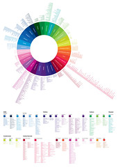
Colour Wheel Associations
&width=400&height=600)
brand associations that are connoted by certain colours. great wheel to help have an awareness of what colours mean what.
see also:
Colour Scheme Harmoniser
Colour in data visualization
Colour in data visualization references
History of Graphic Design

Thursday, 11 June 2009
Time, Space & Activity

Olga surawski's website is clean and clear, and in her infographics section i believe her visual info biking visualisation has had quite a bit of publicity but i would like to see this one in more detail as it looks to be quite an innovative, creative, well hand made collage effect? but other life maps are no less creative and innovative life maps.
i wonder what data variables have been included? message her here Olga Surawska.
she her porfolio here: www.olgasurawska.com
UNSCR

'UNSC/R: this is the abbreviation for the United Nations Security Council
Resolutions.
These documents represent the decisions of the UN’s executive body. This
massiveamount of data (more than 1700 documents) doesn’t come in any organized form.
The purpose of this project is to apply information design strategies to create
visual maps of the Resolutions to help students in politics approach the subject of the
UN.
For more information about this project please visit my blog.'
This is is an interesting project and useful, need to knwo more info as to
how the circles help index, communicate, structure the info.
from here: http://www.pierozagami.com/index.php?/test-1/unscr/
many more shots of this visual there.
Saturday, 6 June 2009
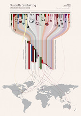
Diagram about crochet
this looks really good. its wierd i have just finished an infographic similar, will share soon.
products top
lines connecting to graph in middle
colour curved to countries on a world map
Really nice. thanks
products top
lines connecting to graph in middle
colour curved to countries on a world map
Really nice. thanks
Transparency: Where Are All the Fish?
this group has some really great infographics. this one is a collaboration between good.is magazine and timko and klick.

Subscribe to:
Posts (Atom)