
'a typographic interpretation of obama's inauguration speech, made for dutch magazine 'creatie' the only rule was no images allowed... i decided to analyse the intonation by watching it on 'you tube' and breaking it down in terms of recurring words and emphasis...'
It is nice to finally see a more creative typographic approach to visualising obama's speeches. Looking at what i like to term typographic nuance, examining the use of alphabet & numbers paradigms.
It really delves into the literature from Post-structuralism, deconstruction (jacques derrida) & barthes, with authorship issues as the meaning (semantics of language) is determined by interpretation on part of the viewer, and so as barthes described this as being the death of the author who is unable to construct meaning.
‘The spoken word is, generally, less formal. Dialogues involve interaction (speaker and listener) are notoriously difficult to ‘control’. This, of course, is also their value; offering the creative, thinking process in its improvised form’ (david jury/about face pg 134).
Of course interpreation takes you into semiotics (the study of signs) with structuraliism french literary theory Ferdinand de Saussure who quite rightly 'posited that signs, rather than being isolated elements with self-contained meanings, are culturally independent parts of an overall network whose meaning is derived from the relationship between the parts’ (Dliteracy, heller/pomeroy, p149).
This cultural independancy is partly the reason that communication has these "open" interpretations of meanings that is where the wonderful (graphic design orientated blogger here) Cranbrook academy and Katerine McCoy, see French Currents of the Letter from 1978 which this work really reminds me of (r.poynor, p66) and jeff keedy & ed fella, then Cranbrook themes continued in David Carson & Neville Brody.
‘Reading requires that we use our intellect, but deconstructed typography further encourages a “shifting movement from awareness to knowledge, to desire and its negation”. The eye roams, looking into the printed page or glowing screen, where meaning is revealed through an evaluation of the entire space. Deconstruction has not simply addressed the look of design but a way of looking at the design’ (GD&R, gunnar swanson ed/zelman, p59).
This type and space led my research onto Stephane Mallarme with 'les coup de des' 1897. Mallarme states, ‘the poem “does not everywhere break with tradition; in its presentation I have in many ways not pushed it far enough forward to shock, yet far enough to open people’s eyes”’. This idea of engaging our intellect and making us interpret this space, typographic deconstruction (GD Concise History, hollis, p37).
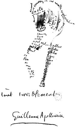
Also not forgetting Guillaume Apollinaire with 'Calligrammes' 1918 leading off to concrete poetry and this fine design is continued with John Furnival & more recent mississippi, functioning ferdinand, 389-type, 3d-calligram, typographic-city-child and probably more.
This coninues quite rightly with word as image as the conversation does not need image as Creatia said no image. Lovely to see Infographics blended together with concrete poetry, I know it is monochrome but does it really need colour? wonderful work.
I explored typographic techniques with examples in my work, just leave comments or sign up to visualthinkmap.ning.com and message visualthinkmap i can share my findings back then.


Great project. Try the word links as there is a lot of good stuff i tried to link through to.
Thanks martin pyper
from: http://www.behance.net/Gallery/obamas-speech-a-typographic-interpretation/209583
found: http://infothesis.yanamitchell.com/post/95935291/obamas-speech-a-typographic-interpretation-on
check out:
type2 nuance a4 sec2 - 2005

poynor reference is from the book No More Rules, (cranbrook link looks inside the book).
No comments:
Post a Comment