Thursday 31 July 2008

Literature Map

Literature Map on Visual Think Map.ning.com
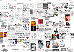
Wonderful little map of relating authors to their similarities, genre. It is similar to music plasma map by Frederic Vavrille previously posted with how it connects musical artists together and actors likewise in a real time animated arrangment steming from the centre of who you searched.

I like tom sharpe and it is no surprise that terry pratchett, p g woodhouse & fear and loathing by hunter s thompson feature in my map.

The graphics/visual leave little to be desired, a bleak blue could have been contrasted with sharp black for the white lettering and maybe a more elegant but still easy to read french script font with a touch of embellishing with it or somewhere in the map display, edges/border. Could heed some advice from observing the subtle style of music plasma.

Anyhow it is a great website tool by marek gibney, literature-map.com produces these great text visual maps of different authors that you might be intersted in to enjoy as I can possibly more comedic pleasure through similarities to one you input.

The literature-map is a part of gnooks, gnooks is apart of gnod, gnod is a project of marek gibney

Similar to music map http://visualthinkmap.ning.com/photo/photo/show?id=2168552%3APhoto%3A67&context=album&albumId=2168552%3AAlbum%3A165

Brilliant, give it a go

Found here: http://actpubliclibrary.blogspot.com/2008/07/literature-map-exploration.html

Sunday 27 July 2008

Media Map


This is a brilliant, detailed map of business's, brands, owners featuring news corp owning BskyB, 20th century fox films, fox or that Disney own dreamworks, miramax, hollywood pictures.

It is an endless discoverey with a conveneint key to guide you through Bureau d'etudes intricate pictorgraphs.

Microsoft own Corbis, or that Viacom own ABC, MTV, CBS, Nickelodeon & Paramount Pictures.

It is done in a similar vein to my Brands Visualisation although by far more complex and spanning a greater number of brands.

The pictographs a bold black and orange runing through it connecting certain people. Its not just America through there is Silvio Berlusconi who owns AC Milan in Italy, & AGC (Autorita per le Garanzie nelle Communicazoni).

It is magnificent and this is not the only one, there is one for Military & Technology, Banques (Banks), Pharmacuticals...

found: http://utangente.free.fr/index2.html

cheers arnaud


Wednesday 23 July 2008

3D CV Map

Cartographer of Complexity. This map is brilliant on so many levels. It has a timeline at the heart mapping its creator's, Arnaud Velten, career from 1992 - 2008.

In a similar vein to the previously posted Life Map by Ritwik Dey it colour codes his subject/interests & locations in to 5 colours Green, Light Green, Yellow, Orange & Red (top left). These are then used as a key to his timeline in the middle near the red circle for 'You are here' I think vous etes ici translates to, my french is limited (but you could presume to start there as it is the first, bold red graphic epicentre almost).

Under the subjects headings for Graphics/Illustration Green are Typography, Creation, & Mise en Page (I think 'read the page' similar to mise en scene). This then progresses to Communication light green, Multimedia yellow, Marketing orange & (I guess, weak french) Intelligence strategies red which is how Arnaud has arrived at Cartographer of Complexity demystifying problems (again, weak french).

In the top right it is very compact and gives extreme depth to this spatial information visualisation (infographic) not through the perception of 3d depth in the 2d form (which is executed brilliantly btw), but actual quantity of data are his competencies of software understanding, frontpage, dreamweaver, corel (similair to freehand), photoshop, flash, indesign, after effects, premiere...

The centre steming from his timeline link off to his jobs, blog interests... so much detail, wish I could read french better as i would probably understand a lot more.

I wonder if his sponsor at the bottom/center, International Bank of Art Money exists.

Absolutely Fantastic Map.

Real Pleasure, thankyou Arnaud.

Featured Here: http://visualthinkmap.ning.com/photo/photo/show?id=2168552%3APhoto%3A543

Found (sent) here: www.as-map.com/ISOMAP.html

High Res PDF here: http://www.as-map.com/ISOMAP-ARNAUD_VELTEN_2007.pdf

Monday 21 July 2008

Mapping Modernism

Not sure how I found the link but i discovered this intersting little timeline map of modernism. Colourful, capturing your atttention thorugh key with a soft white and grey column background to help seperate each individual year from 1910 - 1950.

Mapping Modernism charts 10 of the influencial designers for the period where you can scroll horizontally to see where these designers were at a point in time & click on the time bars to find out more like a concept map (scroll down for description). You can also see a designer's biography by clicking on their name. Some of the ones I know of being:

Serge Chermayeff
Theo Van Doesburg - De Stijl
E. McKnight Kauffer - his tessalating birds illustration for the underground ads.
& Laszlo Moholy-Nagy

Simliar to my type timeline map.

The exhibition Modernism: Designing a brave New World - 1914 - 1939 was 'the first exhibition to explore the concept of Modernism in depth, rather than restricting itself, as previous exhibitions have, to particular geographical centres or to individual decades. Many forms of art and design are represented in the show. But as befits a period when the debates surrounding how people should live took centre stage, the exhibition focuses on architecture and design. The range of objects – including architectural, interior, furniture, product, graphic and fashion design as well as painting, sculpture, film, photography, prints, collage – reflects the period's emphasis on the unity of the arts and the key role of the fine arts in shaping contemporary visual culture'.

Some of these objects include the Club Chair by Marcel Breuer from the Bauhaus under Walter Gropius's leadership. But also the more graphic genius of Hary Beck's Underground Map that has spawned so many more stylised variations in 1933.

Great Mapping.

Found here: http://www.vam.ac.uk/vastatic/microsites/1331_modernism/mapping_modernism.html

Thursday 17 July 2008

Mastification Visualisation

The trident gum ads caused quite a bit of controversy with their creative, pastel coloured surreal ads surrounded around mastification.

mas·ti·cate


Audio Help [mas-ti-keyt]
  1. to chew
  2. to reduce to a pulp by crushing or kneading, as rubber

Trident imaginatively concieve this idea of the mastification lobe in the brain. 'The mastication lobe is the largest member of the lobe family and is the part of the brain responsible for receiving and processing chewing pleasure. When a human man or woman chews, the taste and texture receptors on the upper tongue send trillions of tiny pleasure signals direct to the mastication lobe via an intricate network of neural pathways.'

View the video here (scroll to THE MASTICATION LOBE EXPLAINED)http://www.tridentgum.co.uk/EN/Trident2008/about/movieshtml.htm

It is quirky and uses these crisp pastel colours and graph paper visual along with the tagline 'mastication for the nation' which is where it had problems with ASA (advertising standards authority) here in the UK and subsequently had to stop their campaign, only after it had already been seen in abundance by the public.

Great thinking, mastificate yourself.

Dictionary.com [Origin: 1640–50; mastic, -ate1]

Tuesday 15 July 2008

Type Timeline Map 2


Type Timeline half2
Originally uploaded by visual think map
This visual map explores the relationships/characteristics of the many different typographers/fonts, artistic movements from 1950 - 2008 charting each decade. This is the second half of the type timeline. First half here: http://visualthinkmap.blogspot.com/2008/05/type-timeline-map.html

It was inspired from Stefan Thermerson 'Kurt Schwitters on a time Chart' featured in the brilliant Typographica NS no. 14, December, 1966 edited by Herbert Spencer (Typographica by Rick Poynor 2001).

Tuesday 8 July 2008

Visually Constructing Lewis

This is a clever, creative piece of visual thinking. Abbey take the style of a lewis hamilton & his Mclaren (i think) car as a model kit that you can put together.

Particularly how it breaks the number eight apart at the end and then reconstructs it like model pieces. Really makes you re-think about the shape, form of letters/symbols.

great advert, much in the vein of the Honda ads with the Cog ad of everything working together & the problem playground (blogged previously at this site) of visual thinking, problem solving and piecing things together.

Excellant

Thursday 3 July 2008

UK Brands 2007 Visualisation

This was to visualise the top brands spatially and who owns them/other brands they own also. I started off with well known brand portfolios to visualise them like colgate palmolive but had no direction. So found this top ten list for 2007, and worked from here.

http://www.wonderlandblog.com/wonderland/2007/01/top_ten_most_po.htmle

I liked the vector curved lines like with Maeda's Key magazine covrer post. kept to a soft blue, red pastel palette so you can really visualise the brands and their order, arrangment, ownership.

Was inspired by a car badges brands visual:

coolinfographics.blogspot.com/2008/04/who-owns-car-compan...

featured here: visualthinkmap.ning.com/photo/photo/show?id=2168552%3APho...