Sunday 26 April 2009

Editorial Infographics

hiscox report & accounts 2008 - browns design

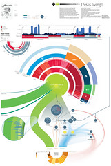
The second annual report for international specialist insurer, Hiscox. Some really nice clean clear editorial functioning work simplyfing the complex volume of data for accounts of hiscox. looks very nice in CR the annual may 09. they also have an excellant contrast with some graphs using a nice technique of different shades to reperesent specific groups of data wihtin a bar (..of a bar chart).

http://www.brownsdesign.com/work/?id=67&subcat=&cat=150&i=377&ia=3

found: cr annual 09 may. See also


The city is the subject of the 21st century. All over the
world, populations are shifting towards urban centres. The Endless City
details an authoritative survey of cities now and the prospects for our urban
future. 34 contributors from across Europe, South America, China, Africa and
the U.S. set the agenda for the city – detailing its successes as well as
its failures. the endless city by atelier works below.


Residential Density & Global Connections

Remind of this that I found at http://thesis.armina.info/node/112
very good blog on infographics & annual report by nicholas feltron see also interview.

Abi Huynh- Emily Carr Institute student paper

Woo is the student publication at the Emily Carr Institute of Art, Design and Media. It is funded through the Student’s Union and has a different staff every school year. Based on our proposal our team was chosen to become the editorial board of the paper for the 2006–2007 school year. Each issue of the paper was assembled by a guest editor and guest art director and therefore each has it’s own distinct visual and conceptual direction. One of the first tasks was to define the look and feel of our incarnation of the student paper and subsequently develop a grid system and style guide. The designers for the five issues were:

Easton West,

Anette K Hansen,


Monika Wyndham,


Todd Takahashi,


Ross Milne,

Grace Partridge,


Dan Kim and


Abi Huynh.


Abi Huynh is a graphic designer originally from Lethbridge, Alberta, Canada, currently living in the Netherlands and attending the Koninklijke Academie van Beeldende Kunsten (Den Haag) in the Type and

Media Masters program.

from: http://www.abiabiabi.com/

Browns also did an interesting project for the climate group.


Identity, book, exhibition, guidelines, literature and website for The Climate
Group, a non-profit organisation dedicated to advancing business and
government leadership on climate change. interesting isometric charts and browns museum space to enclose their data for the climate group.

http://www.brownsdesign.com/work/?id=13&subcat=&cat=38&i=314&ia=8

Saturday 25 April 2009

Aesthetics & Computation Group


instantiating
computation
: tom white

exploring visual representations of different models of computation that
lend themselves to direct manipulation in order to better understand and
construct information spaces


codefocus
: jared schiffman


reeavaluating the process of writing programs and the visual environment
in which this activity takes place. to make writing and reading code
more inuitive through an enhanced visual infrastructure


anemone
(live version)
: ben fry


using the process of organic information design to visualize the
changing structure of a web site, juxtaposed with usage information


genomic
cartography
: ben fry


a series of experiments combining visualization and genomics.
expressing qualitative features of the human genome through advanced
visual representations.

These are some of the projects that I will certainly try to have a deeper
reader about from the aesthetics and computation group featuring john maeda and
ben fry. I was aware of the project below as most people are,


processing :
ben fry and casey reas


processing is an environment for learning the fundamentals of computer
programming within the context of the electronic arts. it is an electronic
sketchbook for developing ideas. processing is an open project initiated
by ben fry and casey reas, of the interaction design institute ivrea.

A very good group that i will certainly follow to keep
up-to-date as they try to explore language, mapping (space), communication.
Truly creative projects that I must have a good read, may just have to blog
individually upon further inspection. I found this group through http://feedproxy.google.com/~r/serialconsign/~3/PKLFOJPUrDM/information-visualization-and-interface-culture with a review of a chapter written by greg smith for Handbook of Research on Computational Arts and Creative Informatics which will be released
sometime in the next several weeks.

Data Mapping

SpatialKey is a next generation Information Visualization, Mapping, Analysis and Reporting System. It is designed to help organizations quickly assess location based information critical to their organizational goals, decision making processes and reporting requirements.

It looks really good, and I think you can upload your own csv data and have it visualised.

http://www.spatialkey.com/

Think it was either Data Mining, or Visual Analytics on LinkedIn that i spotted the link.

Wednesday 22 April 2009

Visual Cooking


From Density Densign some great exploration of instructional cooking with varied styles.

Also search lauren bugeja i think her name was, previous post http://visualthinkmap.blogspot.com/search?q=coo

Good stuff. you can buy a copy, although it is italian.

Friday 17 April 2009

Typographic Nuance

'a typographic interpretation of obama's inauguration speech, made for dutch magazine 'creatie' the only rule was no images allowed... i decided to analyse the intonation by watching it on 'you tube' and breaking it down in terms of recurring words and emphasis...'

It is nice to finally see a more creative typographic approach to visualising obama's speeches. Looking at what i like to term typographic nuance, examining the use of alphabet & numbers paradigms.

It really delves into the literature from Post-structuralism, deconstruction (jacques derrida) & barthes, with authorship issues as the meaning (semantics of language) is determined by interpretation on part of the viewer, and so as barthes described this as being the death of the author who is unable to construct meaning.

‘The spoken word is, generally, less formal. Dialogues involve interaction (speaker and listener) are notoriously difficult to ‘control’. This, of course, is also their value; offering the creative, thinking process in its improvised form’ (david jury/about face pg 134).

Of course interpreation takes you into semiotics (the study of signs) with structuraliism french literary theory Ferdinand de Saussure who quite rightly 'posited that signs, rather than being isolated elements with self-contained meanings, are culturally independent parts of an overall network whose meaning is derived from the relationship between the parts’ (Dliteracy, heller/pomeroy, p149).

This cultural independancy is partly the reason that communication has these "open" interpretations of meanings that is where the wonderful (graphic design orientated blogger here) Cranbrook academy and Katerine McCoy, see French Currents of the Letter from 1978 which this work really reminds me of (r.poynor, p66) and jeff keedy & ed fella, then Cranbrook themes continued in David Carson & Neville Brody.

‘Reading requires that we use our intellect, but deconstructed typography further encourages a “shifting movement from awareness to knowledge, to desire and its negation”. The eye roams, looking into the printed page or glowing screen, where meaning is revealed through an evaluation of the entire space. Deconstruction has not simply addressed the look of design but a way of looking at the design’ (GD&R, gunnar swanson ed/zelman, p59).

This type and space led my research onto Stephane Mallarme with 'les coup de des' 1897. Mallarme states, ‘the poem “does not everywhere break with tradition; in its presentation I have in many ways not pushed it far enough forward to shock, yet far enough to open people’s eyes”’. This idea of engaging our intellect and making us interpret this space, typographic deconstruction (GD Concise History, hollis, p37).

Also not forgetting Guillaume Apollinaire with 'Calligrammes' 1918 leading off to concrete poetry and this fine design is continued with John Furnival & more recent mississippi, functioning ferdinand, 389-type, 3d-calligram, typographic-city-child and probably more.

This coninues quite rightly with word as image as the conversation does not need image as Creatia said no image. Lovely to see Infographics blended together with concrete poetry, I know it is monochrome but does it really need colour? wonderful work.

I explored typographic techniques with examples in my work, just leave comments or sign up to visualthinkmap.ning.com and message visualthinkmap i can share my findings back then.


Great project. Try the word links as there is a lot of good stuff i tried to link through to.

Thanks martin pyper

from: http://www.behance.net/Gallery/obamas-speech-a-typographic-interpretation/209583


found: http://infothesis.yanamitchell.com/post/95935291/obamas-speech-a-typographic-interpretation-on


check out:

type2 nuance a4 sec2 - 2005

by visual think map


type nuance a4 sec1 - 2005

poynor reference is from the book No More Rules, (cranbrook link looks inside the book).

Tuesday 14 April 2009

Housing & Poverty - Density Design


Housing & Poverty
Originally uploaded by densitydesign
I dont blog every density design visual even though it is tempting, as they are so clear and beautiful. But this one i had to, another excellant visual. always like julien bayle says, clear, clean, simplfied complexity and the bold colours just draw you into closer inspection, had to look it in the largest size for 'all sizes'.

would say the lines arent so easy to follow for the population at bottom, but dont strictly need to follow the individual lines and adds beautiful texture to contrast the bold colours.

i'm sure the lines have levels of solidarity too them also for further info of importance/density.

just great stuff from milan as always.

visit: http://www.densitydesign.org/

rss: http://www.densitydesign.org/feed/

Saturday 11 April 2009

Mapping the Creative Process

Damn good stuff they make, wish they were more prolific in their creation but they are well
worth the wait. How appropriate then their next one is the Creative Process. I'm sure we all
think things can be included but they have pretty much nailed it. I am sure it will be doing the blog rounds as it is well deserved, but as from the blogs I am fed and try to digest from google reader it hasnt yet, so lets start the ball rolling.

Share with your many more readers than mine and explore their versatile and equally clear 'back catalogue'.


I tell you, the amount of posters I want to print so big and put up in a classroom, Periodic table of Typefaces, this, Periodic Table of Design, psd-poster - shortcuts by designbyvent, Type Timeline Map... and I'd be tempted with Periodic Table of Visualisation Methods, Information Aesthetics Diagram.

Here's what they say,

'The creative process is not just iterative; it’s also recursive. It plays out “in the large” and “in the small”— in defining the broadest goals and concepts and refining the smallest details. It branches like a tree, and each choice has ramifications, which may not be known in advance.

Recursion also suggests a procedure that “calls” or includes itself. Many engineers
define the design process as a recursive function:

discover > define > design > develop > deploy


The creative process involves many conversations—about goals and actions to achieve them—conversations with co-creators and colleagues, conversations with oneself.
The participants and their language, experience, and values affect the conversations'.

http://www.dubberly.com/concept-maps

Download PDF - http://www.dubberly.com/wp-content/uploads/2009/03/ddo_creative_process.pdf

check out their model of innovation concept map,

Innovation concept map by hugh dubberly , Sean Durham, Ryan Reposar, Paul Pangaro, and Nathan Felde

More here:
A Model of The Creative Process
A Model of Play

How Organizations Track Customers

Domain Name Map

Friday 10 April 2009

What Is Isometric?


this is s sketched recording of defining isometric with word and image in a graph.
you can record voice with these, not sure if music. its free, its easy great
tool. http://sketchcast.com/view/1c74470/

found tool here:
http://johncaswell.com/blog/


excellant blog

sketchcast. sketch - record - embed

find my video here: http://visualthinkmap.ning.com/video/what-is-isometric

see Lee and Sachi LeFever's videos http://visualthinkmap.blogspot.com/search?q=common+craft

some more good tools in this post by robert http://eagereyes.org/blog/2009/where-are-the-visualization-tools.html

more tools here too: http://visualthinkmap.ning.com/ (scroll down to links-tools)

Tuesday 7 April 2009

Web Trend Map 09


web trend map 09 beta
It is here, just noticed it here at Benjamin Wiederkehr and Christian Siegrist: www.datavisualization.ch/

looks really good. IA's previous versions were very good, and they have managed
to improve upon them.

loved the isometric, but they have given it further depth like the tubes and it
has the level of popularity with the height dimension explored.

I like how they have brought in the people symbols/isotypes walking in this
new geographic terrain of the web similar to what was done on this

http://visualthinkmap.ning.com/photo/photo/show?id=2168552%3APhoto%3A2498

I think it is a great improvement, not that it needed it. wish i knew how to
say 'brilliant, thanks' in japanese.

from here: http://www.flickr.com/photos/formforce/3409362834/

previous version here:

Web Trend Map 2008 Beta
Also check out this:
Subway Blogs Map
Oxfam Tube Map
Snack on my Maps
Eustace Tilley Subway by Alberto Forero (2008)

Useful recent link/posts I have noticed.

InfoVis design tests. by brad paley

The Importance of colour in data visualization

An Introduction to Visualising Data pdf by Joel Laumans. an excellant beginners
guide, well designed


Havard Info Visualisation Course

Thursday 2 April 2009

Bush


You dont need to be able to read spanish* to undertand this infographic by Samuel Granados, well maybe a little for deeper ajudication.


desaprobacion = diapproval - red


Found on density design and samuel has no doubt lost none of their brilliant design skills being a former student in information graphics + function + beauty as this parchment effect paper gives it a historical document of 'manuscript' importance. With a lovely surreality of an abstract cutting of the top head technique it has some harmony of green and red graduation with a timeline of bush's office. I should find out how long it took samuel to make the 4 pages but really good. Good tabing to create the familiar syntax of folders/files.

Really good.

from: http://www.elmundo.es/especiales/2008/09/internacional/elecciones_eeuu/presidentes/bush.html

found: http://www.densitydesign.org/2009/01/16/radiografia-de-la-presidencia-bush-a-radiography-of-the-bush-precidency/

*I had put italian but have changed it when reminded which I knew as I had to translate but hadnt changed. thanks ;o)