Wednesday 30 April 2008

Viz Think 08

Talking about Viz Think 08 (David Gray Blog - Communication Nation) Stephen Few expresses concerns over drawings. The other speakers hired 'they don’t accurately represent the spectrum of visual thinking, and that the list of topics is heavily skewed, primarily toward the use of drawings to record ideas (such as during a brainstorming meeting) or in printed form to explain something, such as a concept or process' (Visual Business Intelligence A blog by Stephen Few).

He express his concerns over visual thinking at Viz Think 08 not just being about drawing in his blog post Not every picture is worth a thousand words (dec 07). He rightly points out that visual thinking should include the exciting ways in which it 'is supported by technology today: information visualization—”the use of computer-supported interactive visual representations of abstract data to amplify cognition” (Card, Mackinlay, and Shneiderman, Readings in Information Visualization: Using Vision to Think - Interactive Technologies, 1999).

Technologies that created the previous post featuring Julien Bayles Dynamic Clock. I stumbled accross the image featured that I thought was a great spatial visualisation of the aspects involved in visual thinking that I assume is by Stephen Few. Its similiar style to the artist Eboy featured in Illustration Now! - 150 Illustrators featuring some of these technologies that integrate into this visual thinking spectrum such as navigating Virtual Worlds or Video Communication distributed by Utube via what should be featured in the illustration the internet. I particularly like the guy featured in the bottom right, 'communication skills, problem solving & drawing' definetly needed to visually think & design - solve.

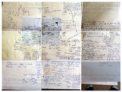
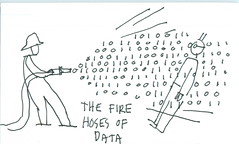
But technology does have a huge influence on visual thinking, it allows us to communicate/collaborate ideas accross the world/virtual world instantly it also allows us to catalogue/collate these wonderful & varied abstract data visualisations from notebooks to concept maps.

Tuesday 29 April 2008

Dynamic Time Visualisation


Julien Bayle.net talks about visual design and more. He works on social network visualizations, generative art and data visualizations.

He has had some of his social network visualisations published on visual complexity.com.

His dynamic clock to visualise time is simple and innovative. Rather than just static numbers around a circle and handles, he uses space (area) in circles to represent the amount of time elapsed in seconds (dark blue), minutes (white) & hours (light blue).

A great alternative perspective to time rather than the usual. Certainly making the familiar strange through a conflict that needs to be interpreted.


http://www.julienbayle.net/complexity/visualization/clock/

Monday 28 April 2008

note map whole - communication (3x3 A3)

'linking notes' i think curzon (teaching) calls them.

i needed to see my whole ideas in one view, to help me connect my ideas literally accross the visual scene.

as much as this helped it was not surprisingly becoming too large, i'd have to go on a walk to see the other end (only joking). i started with the grey a4 photocopy of a previous brainstorm of communication then reflecting on it after some time i expanded it with thoughts at that time, arrangement of poetry, time, painting or speech (syntax).

Finally settled on using a notebook, as i could 'flick' back pages to reasses my research.

still it was a nice visual.

Monday 21 April 2008

BrainLand


Wallpaper-1600x1200
Originally uploaded by Unit Seven
This is another excellant subversion of a style usually associated with geographic maps, with grid references of ordance survey and great depth of relief terrain shading... of the mind.

The subtle graduation of blue for sea tropically encompassing the Blood brain barrier reef (what wonderful characters they would be in the reef) and a brown, beige 'land' containing Isles of Imagination.

I would like to topographically follow the 'salience trail'.

Wonderful surreal visual map of the mind.

Sunday 20 April 2008

Anatomy of the mortal Soul

Was featured in creative review 07 that was guest edited by Mother. like the notion of mapping the soul. it has a lovely old parchment style.

Very surreal with elements like Excaliber in the soul, and the Washing Up.

Saturday 19 April 2008

Medieval Mind Trip - BBC4

Agency: RKCR/Y&R
Creative Director: Damon Collins
Creative: Jules Chalkley; Nick Simons
Director: James Price
Production: Strange Beast
Producer: Kayt Hall
Music: Tam Nightingale, Nightingale Music

This wonderful visual charting the mind of a medieval citizen was created over five weeks with a team of six animators working out of Transistor Studios, the spot delves deep into the facts and fictions of medieval life through a series of intricately detailed shots exploring the images, ideas and iconography of the period. From science and religion to plague and pestilence. The spot brings to life a mind-bending taster of what's to come in the forthcoming BBC4 Medieval Season.

Damon Collins' first project as executive creative director at RKCR/Y&R since leaving Mother at the end of 2007. This his first project at RK he recalls with a grin. "They're a brilliant client (BBC), though challenging when it comes to timings. [...] eight weeks from initial brief to air date."

Collins and his crew started brainstorming ways to convey medieval life stylishly and succinctly. "The idea of the trip came from the fact that stuff people believed in, the things they did and even the colour of the world back then are almost impossible for our minds to contemplate today," Collins explains. "It was a different, bonkers, but very beautiful world, hence the comparison with watching the season being like a drug trip." This bonkers world that might contain images of people with wolves heads similar to characters that Andrew Rae might have drawn featured in Basics Illustration: Thinking Visually by Mark Wigan.

With Strange Beast director James Price at the helm of the animation on the spot. "When Damon mentioned they where re-recording Purple Haze with Medieval instruments I knew this was going to be really a really unique project, so it really gave me the impetus to push the design and just go wild with it," recalls Price.

With the idea of reworking Jimmy Hendrix' Purple Haze it was arranged and recorded by Pascal Bideau and Tam Nightingale who have a penchant for period instruments . The musicians who took part in the project are: Jon Banks (tef), Sharon Lindo (rebec, viol), Keith McGowan (hurdy gurdy, shawm, rackett, curtle), Emma Murphy (recorders).

See the complete article source here:

http://www.shots.net/news_detail.asp?id=4121

Friday 18 April 2008

Eustace Tilley Subway by Alberto Forero (2008)

This is such a clever little map for yet another New York sourced magazine (see Key Magazine NY Times post).

This popular underground map style created by Harry Beck subverted into another context. Since Simon Patterson subverted the underground map style in The Great Bear 1992 i think it has ignited many more styled.

Visual Poetry 05

“I was visually inspired by L-System algorithms. However, it did not make sense to use any recursive algorithms. But I picked up the idea that certain symbols in a text would control the growth of the tree. Specific letter-combinations would create a new branch, others would make it grow stronger. So the final tree-structure would be a direct result of the letter sequence in the text. Therefore, every poem is represented by its own, distinct tree.” muller, boris

These are beautiful but 'Information aesthetic visualizations should appeal both to the mind and soul. While they positively stimulate our senses, in terms of engagement, involvement, and imagination, they are also optimized for the specific task of conveying complex data-driven concepts in intuitive and easily comprehensible ways. It is not a surprise then, that the most successful infographics use creative design insights'. Vande Moere, Andrew

This reiterates what has been mentioned upon with Wordless Recipics by Lauren Bugeja post that the GUI (graphic user interface) should utilise engagement allowing greater playfulness through more challenge, presenter control, and variety in a game for browsing. These creative design insights are being aware of the salience, redundacy etc.

Andrew Vande Moere - Lecturer/Assistant Professor Key Centre of Design Computing & Cognition

http://pingmag.jp/2007/03/23/infosthetics-form-follows-data/
http://web.arch.usyd.edu.au/~andrew/
http://www.esono.com/boris/projects/poetry05/

Thursday 17 April 2008

The Whirl - Ways of Meaning

Watch 'The Whirl' clicking here
(video was embeded but but was slow to load)

Why visual language can help us deal with the information age.

He talks about some of the cognitive challenges of the information age, and why visual language is an important tool for dealing with them. Also talking about how information is non linear today, hence visual maps of non-linear information connected in multidirectional, interdisciplinary, 'open' meanings of communication.

Take the cadburys gorilla, is there a meaning?

http://www.davegray.info/2008/04/11/the-whirl/

Monday 14 April 2008

Data Brigade


Index card
Originally uploaded by dgray_xplane
great doodle by dave gray of Viz Think!

featured on flickR.

wonderful visual thinking.

A History of Evil


brilliant, animated visual thinking.

The film was intended to show what people have believed in and pointed to as evil throughout history. It was meant to get you to think about what evil really is. It is meant to show that when we get too obsessed with "evil" we might end up taking part in it ourselves.

Saturday 12 April 2008

IK Brunel's Notebooks - 200th anniversary


200th anninversary of Isambard Kingdom Brunel

Brunel was one of the most versatile and audacious engineers of the 19th century, responsible for the design of tunnels, bridges, railway lines and ships.

The work for which Brunel is probably best remembered is his construction of a network of tunnels, bridges and viaducts for the Great Western Railway. In 1833, he was appointed their chief engineer and work began on the line that linked London to Bristol. Impressive achievements during its construction included the viaducts at Hanwell and Chippenham, the Maidenhead Bridge, the Box Tunnel and Bristol Temple Meads Station.

As well as bridges, tunnels and railways, Brunel was responsible for the design of several famous ships. The 'Great Western', launched in 1837, was the first steamship to engage in transatlantic service. The 'Great Britain', launched in 1843, was the world's first iron-hulled, screw propeller-driven, steam-powered passenger liner. The 'Great Eastern', launched in 1859, was designed in cooperation with John Scott Russell, and was by far the biggest ship ever built up to that time, but was not commercially successful.

http://www.brunel200.com/

http://www.bbc.co.uk/history/historic_figures/brunel_kingdom_isambard.shtml

Tuesday 8 April 2008

Visual Communication: Wordless Recipics

http://www.coo.kz/

This is the website Lauren Bugeja has created to house these beautiful visual maps. The visual equivalent of a thesis - work from her final semester in Visual Communications.

She calls these visual maps Recipics, good use of ambiguity in the word pun on recipes. These are great explorations of visually mapping information making it universally accessible. She still uses the paradigm of numbers & arrows, but what I like best is how she uses these & space to depict time & measurements fig. Depicting time in a similar tecnhique to Bradford Paley in Once more around the sun. She uses faded flames contrasted to full colour to depict gas mark, which is admirable technique removing the use of numbers.

She has great experiments between mimetic depictions of food, but creates great iconic characters to represent meats i.e. lamb=sheep, beef=cow & pork=pig, fig.

Bugeja acknowledges the occasional stumbling block: “The ingredients are still a work in progress,” she said. “For example, it’s hard to explain the difference between flour, baking powder, anthrax and cocaine without words.”

A clean sans serif font, & beautiful pastel colours really caps off a great, excellantly executed idea.

Her research map as she calls it, looks at the contrast of word & images, human factors with Human Information Processing with communication. In relation to interaction of the GUI (graphic user interface) she states the same as I have researched with engagement allowing greater playfulness through more challenge, presenter control, and variety in a game for browsing.

What’s most relevant here is the Information Architecture to ‘organise information to create meaning’ through ‘scheme & structure’ i.e. mental schemas and these visual map techniques of brainstorms, spider diagrams etc (Bugeja, 2008, p VC Major project). There are many more beautiful visual maps of all topics linked under diagram diaries on flickr.

http://www.flickr.com/photos/laurenbugeja/sets/72157594238802216/

Monday 7 April 2008

Da Vinci: Notebooks as Thinking Artefacts

Not all visual maps involve these beautiful, elaboratly designed concept maps, mindmaps, spider diagrams with time & knowledge of coding/art to create.

The notebook is easily portable with the only need being a pen without the need for your other research files/books to hand. It allows your thoughts to be readily reflected upon and more chance of the critical point of engagement utilised.

Many great thinkers utilised notebooks such as I.K. Brunel featured on you tube at my blog, Paula Scher (pentagram partner) likewise blog, also Leonardo Da Vinci who worked between Science & Art, fig,

‘Page after page of Leonardo’s manuscripts has a gentle but thorough integration of text and figure […] the use of words and pictures together requires a special sensitivity to the purpose of design. [W]hether the graphic is primarily for communication and illustration of a settled finding or, in contrast, for the exploration of a data set.’ (Tufte, 2001, p.182).

I have created a notebook that use’s drawing and writing to combine ideas and readings across varying sectors of design. I use drawing as a research tool as well as writing; fig. This special sensitivity to design are some of the design issues surrounding form and function, and contrasts of light/dark, thick/thin (salience), framing, use of white space, or colour harmony.

'words on and around graphics are highly effective-sometimes all too effective-in telling viewers how to allocate their attention to the various parts of the data display’ (Tufte, 2001, p.182).

Mind maps, brainstorms and notebooks are visual research (visual maps). In the book Visual Research: An Introduction to Research Methodologies in Graphic Design (Advanced Level), ‘it is possible to critique action so as to produce more enlightened or more effective forms of action. The critical thinking in this tradition is a practice in the world, a praxis’ (Noble & Beastley, 2005, p 9).

Critical thinking is what is trying to be achieved through notebooks, visual maps. Praxis is if we look at Aristotle states, ‘practice is the application of that knowledge to solve problems’, this is what design is problem solving.

Visual diaries & notebooks are a form of ‘action research – where a diary tells, in a step-by-step way, of a practical experiment in the studio’. This is ‘research through art and design’, ‘where the end product is an artefact – where the thinking is, so to speak, embodied in the artefact’ (Frayling, 1993/4, p.5).

mini bibliography

Tufte, E R. (2001). Envisioning Information. Graphics Press LLC , Connecticut

Noble, Ian & Bestley, Russell. (2005). Visual Research: An Introduction to Research Methodologies in Graphic Design (Advanced Level). SA, AVA Publishing

Frayling, C. (1993/4). Research in Art & Design. Royal College, Vol 1, No 1. London.

Da vinci figure from : Pederetti, Carlo. (2006). Leonardo Da Vinci. UK, Tajbook

Sunday 6 April 2008

Web Trend Map 2008 Beta

Not all visual maps are prescribed to geographic content. Moving away from the past 3 maps of geography but continuing the theme of technology, there is this wonderful map from the Information Architects mapping popular internet websites.

In its second version they've 'taken almost 300 of the most influential and successful websites and pinned them down to the greater Tokyo-area train map. By popular demand, we enlarged the poster size from A3 to A0' (greber, 2008, web-trend-map-2008-beta).

In the popular style of train/underground maps, first started by Harry Beck’s London Underground map, which he developed from 1931 onwards, they are being subverted into alternative content, like here of websites map. Their clear, clean white space [1] is highly effective for organisation of information.

It is a type of

concept map

that is similar to brainstorms where it connects ideas and to that of mind maps. They are ‘graphical representation[s] where nodes (points or vertices) represent concepts (defined by [Joseph .D] Novak[2] as perceived regularities in objects and events), and links (arcs or lines) represent the relationships between concepts’. These objects and events are the common features which we abstract from our experience. The events form Wordsworth’s childhood memories that are ‘“sources of adult confidence and creativity”’ and helped him when writing Daffodils, or the visual memories in Barcelona of Picasso that inspired the painting of ‘Les Demoiselles of D’avignon’ and the objects could be the Iberian sculpture, or the Monet painting that also inspired him (Coffey, Hoffman, Cañas, & Ford, 2002, p. 2), (Sharples, 1999, p. 48).

‘Concept maps are used to form knowledge models by placing them in a hierarchical organization and appending elaborating media onto the nodes within each map’ (Montello, 2002, p.2). An excellent example of this is the search engine KartOO. The elaborate media stated are the hyperlinks, animations that are activated when you click on one of the nodes (website names).

Overall it is an excellant map utilising white space & framing knowledge beautifully, brilliant balance of form/function. More articles will come featuring projects mapping the internet.

Online Clickable links version - excellant concept map
http://informationarchitects.jp/webtrendmap3/trendmap2008.html

[1] ‘white space is, perhaps, the most important, [...] aspect of writing as visual design. According to James Hartley, a psychologist who studied the visual design of text, good use of white space can help a reader to: See redundancies in the text & thus faster reading; See more easily which bits of text are personally relevant for them, See the structure of the document as a whole; Grasp its organisation’ (Sharples, 1999, p.141).

[2] Joseph D. Novak studied the concept mapping technique in the 60’s at Cornell University.

mini bibliography

gerber, matt. (2008). Web trend map.
http://informationarchitects.jp/web-trend-map-2008-beta/ Friday, January 25th, 2008

Sharples, Mike. (1999). How We Write: writing as creative design. Routledge, London

Google. (2007). Search – Cognitive Mapping
http://intraspec.ca/12montello.pdf. Montello, David. (2002). Cognitive Map-Design Research in the Twentieth Century: Theoretical and Empirical Approaches. Cartographic and Geographic Information Sciences, Vol. 29, No. 3, pp.283-304

Google. (2007). Search – Cognitive Mapping
http://intraspec.ca/cogmap.php. John W. Coffey, Robert R. Hoffman, Alberto J. Cañas & Kenneth M. Ford. (2002). A Concept Map-Based Knowledge Modelling Approach to Expert Knowledge Sharing*, Florida Institute for Human and Machine Cognition, Pensacola Fl, 32502, viewed 30 June 2007, http://www.ihmc.us/users/acanas/Publications/IKS2002/IKS.htm

Friday 4 April 2008

New York Times Key Magazine Cover


Note that I dont have an obsession with New York at the moment, but with such great art foundations of Rauschenberg, DeKooning & Pollock its no surprise of its creative vein. Today technology is the key that has fused creativity & opened boundaries to allow interdisciplinary practice.

The New York Times real estate magazine Key started with the cover design concept of hiring people that are brilliant to do personal interpretations of what a key means to them & their lives. The 1st cover in the Fall 2006 by Carin Goldberg featured all the places she lived at using the font Dynamoe (green & black thumbnail) & spring 2007 (yellow & purple thumbnail) was designed by new york design studio 2x4.

In dialogue with John Maeda (author of Creative Code: Aesthetics + Computation) art director Dick Barnett looked at some of Maeda's sketches and replied to him saying how he's 'loving #3 Google Mappish Mondrian' (3rd thumbnail along) idea and how he might 'think of a way to make it more personal to [maeda's] life'. Maeda responded utilising Boston, he states how he 'thinks of the world as a sort of map of cities', a topographic territory, he 'mined the internet for all the cities with an airport' & made a simple diagram and then drew some 'fluid like curves [framing] to connect into the centre of the keyhole' (4th thumbnail), (Centaur Publication, 2007, p. nov – 42).

Maeda wanted to concentrate on the background rather than the foreground & after some design processing (problem solving) such as replacing fonts used to that of Key magazines T-Star, it was finished. The design is brilliant, although probably not that easy a task to create without access/stroke knowledge of computer science functionality but excellant aesthetics. The overall white stands out from the blue (a colour normally percieved as depiciting sea in maps) causing a slight incongruity on part of the viewer, map reader/user. Boston being the epicentre of travel in this map providing the key access to other cities and the viral red linking lines spidering the topgraphic locations.

Excellant Map utilising technology to visualise data functionality mentioned upon with Bradford Paley, in the heart of its design.

'John Maeda is an artist and a computer scientist, and he views the computer not as a substitute for brush and paint but as an artistic medium in its own right. His mission is to foster the growth of what he calls 'humanist technologists'- people that are capable of articulating future culture through informed understanding of the technologies they use' (http://www.designboom.com/eng/interview/maeda.html, 2008, p. john maeda interview).

More examples of the stages of Maeda's Key Cover design here, http://www.nytimes.com/slideshow/2007/09/06/realestate/keymagazine/20070909_KEY_COV_SS_index.html

Creative Review. New York. Centaur Publication, 2007, p. nov – 42).