Monday 30 June 2008

Mobile Phone Drawing Maps

Landlines is a multi-user collaborative drawing tool for GPS enabled mobile phones, in which users draw by moving in real space.

There are two different visual interfaces for drawing these route maps using this innovative drawing tool, the ever popular googlemaps application, and a Flash application ‘Mapper’.

Mapper allows you to see routes as live drawings, in collaboration with other users. This is the application that they use for exhibitions and workshops.They have concentrated on the drawn quality of the line, keeping the whereabouts of users anonymous, and on the resulting map like drawings gradually revealing a place.

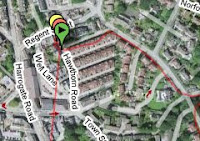
These are great, abstract ways of drawing with different media and create route maps of their journeys.
.
.

Thursday 26 June 2008

Street Visual Perception

These visual chalk drawings are great illusions of depth in our environment. changing our perspectives, and here, providing us with some wonderful humour.

Julian Beever is an English artist who's famous for his art on the pavement of England, France, Germany, USA, Australia and Belgium . Beever gives to his drawings an amazing 3D illusion.

The second one it takes a second look to tell which ones real.

Fantastic.

Friday 20 June 2008

Visual Choreography Notes

These pages from his book Changes: Notes on Choreography by Merce Cunningham are fantastic visual thinking explorations of dance space. These wonderful pages of red topographic movement and complimentary weaving lines of type notes are great explorations of the notebook spread themselves.

They are very similar in style to the spreads from Kurt Schwitters & Theo Van Doesburg in 1920 - 30's De Stijl or even Dada from Picabia. Very abstract compositions with varying line qualities and shapes.

Merce Cunningham is one of the most influential and innovative choreographers of the twentieth century. His works, such as Summerspace (1958), are in the repertoire of internationally celebrated companies, including the New York City Ballet, the Paris Opéra, Zurich Ballet, and Rambert Dance Company, among others. Along with John Cage, Cunningham collaborated with other contemporaries, including Jaspar Johns, Andy Warhol, David Tudor, Frank Stella and Robert Rauschenberg.

Cunningham is not interested in narrative and character development; his choreography investigates the formal elements of dance. Cunningham and Cage shared the belief that movement and music are equal. Accordingly, they created the choreography and music separately in their collaborations.


Merce Cunningham Info Source: http://www.artsalive.ca/en/dan/meet/bios/artistDetail.asp?artistID=165

Image Source: Cunningham, Merce and Frances Starr, ed. Changes: Notes on Choreography. New York: Something Else Press, 1968 featured in Creative Reviews - March 08 - p42.

Tuesday 17 June 2008

Map of Carnaby Street

Fantastic visual navigation system for the area surrounding Carnaby Street in Soho, London.

It has wonderful curved, clean edges with subtle pastel colours for the different categories of shops to aid efficient thinking and finding info. the grey's provide a soft contrast emphasising the bright pastel colours with still room for info of the nearest tubes all harmonised in this unifying circle. it still has room inside it to depict an upper and lower floor plan.

Great visual map for london soho.

Sunday 15 June 2008

Adobe CS3 Icons Visual Map


Adobe CS3 icons
Originally uploaded by The High Contrast
This was a great little map I saw posted on flickr from the user the high contrast (featured in blogroll). great how adobe chose their colours from the colour wheel and where they positioned the program icons.

Sunday 8 June 2008

Evolution of Life Visual

Following on from Watch the Evolution Design post this info - graphic map elicits great visual thinking.

It has so much detail charting life evolving on land, in water against a geological timeline with such subtle pastel colours, little line illustrations & sharp pink sectioning, similiar form to the Liverpool Map. It is brilliant.

It appears on p.32 of the Unknown. (1993). Times Atlas of the world (concise edition) 6th Ed. Hammond World Atlas Corporation. First published in 1982, this book has become a classic of reference publishing around the globe. The acknowledgements section gives picture credit to "Encyclopaedia Universalis".

Encyclopædia Universalis is published in French (by Encyclopædia Britannica) and the current edition has been hailed as an irreplaceable reference. One of the distinguishing features of this set is its intelligent structure. With more than 18,000 bibliographical notes, 50,000 entries, and 280,000 references, the 4-volume Index is the master key to this work. The 23-volume Corpus, with more than 6,000 in-depth articles on various subjects covering nearly every field, can be considered a summary of all knowledge.

It has more than 4,000 world-renowned authors, and with these vivid info graphics, they literally bring to life every topic engaging readers and explaining more complicated topics.

Source: http://eb.com/Product_EU.htm
Image: Steve M, cheers.

Thursday 5 June 2008

Watch the Evolution Design

Tom Gauld visualised time a little differently challenging our perceptions in his drawings, doodle style thinking, watch design visual for United Arrows called EVOLUTION.

Rather than using numbers normally depiciting time he takes his solid black characters to depict time as a sequence in evolution as opposed to a sequence in numbers paradigm.

Another great alternative perspective to time (see Dynamic Time Visualisation) that still functions through the placing of the images, it merely making the familiar strange creating a conflict in form (doodles rather than numbers) that needs to be interpreted.

There are many great quirky illustrations by Tom Gauld charting his fantastic imagination who is featured in The Picture Book: Contemporary Illustration & Pictures and Words: New Comic Art and Narrative Illustration.


Source: http://images.google.co.uk/imgres?imgurl=http://www.cabanonpress.com/images/tomsbits/watch.jpg&imgrefurl=http://www.cabanonpress.com/tomsshed/8.2.watch.htm&h=434&w=402&sz=37&hl=en&start=1&sig2=jgEeYSpw3VoosVMsW7QO9A&um=1&tbnid=rHPWzGlc3AvO6M:&tbnh=126&tbnw=117&ei=HDVISInoNYuw6wPt7ujwBA&prev=/images%3Fq%3Dgauld%2Bevolution%2Bwatch%26um%3D1%26hl%3Den

Sunday 1 June 2008

Typographic City - The Child


Alex Gopher visualises typographically new york city in this highly creative video The Child. It is crafted superbly and is wonderful modern concrete poetry animated. It was directed by H5 who I first noticed in Quentin Newark's What is Graphic Design?.

I came accross The Child when viewing another typographic experiment when I discovered the blog TextVis Recherche 3 featuring Graphic City. It is a pure typography animation which involved the exploration of typography and also the personal feeling of the modern cities. This blog captured a huge range of typographic animations, experiments that are in circa. Great Blog and wonderful text visuals.