Thursday 29 May 2008

Internet Undersea Map

TeleGeography create these brilliant visual map's with subtle colours and stimulate our thinking with clean, clear info graphic pye charts.

TeleGeography's innovative approach to cartography distills complex data sets into attractive posters for hanging on your wall. All maps measure approximately 37" x 51" (0.9m x 1.2m) and are printed on highly durable synthetic stock called Yupo, that is much more durable than traditional paper.

They have a more detailed map of the underground cables in this Submarine Cable Map 2008. The latest edition includes information for over 120 submarine cable systems, including major systems that are in service as well as announced cable systems expected to join a reinvigorated cable market. All data contained in the map is drawn from our Global Bandwidth Research Service, their definitive guide to the supply, demand and pricing of international bandwidth.

The map contains nine informative graphics that describe the state of the submarine cable market including a depiction of how capacity is used on the trans-Atlantic route. The connecting lines are lovely and organic almost hand rendered as was with Key Magazine Cover by John Maeda

They also have made maps for,

European Terrestrial Networks Map
Global Internet Map
& Global Traffic Map

Internet Undersea World Map seen here thorugh guardian:
http://image.guardian.co.uk/sys-images/Technology/Pix/pictures/2008/02/01/SeaCableHi.jpg

Bigger version here:
http://image.guardian.co.uk/sys-files/Guardian/documents/2008/02/01/SEA_CABLES_010208.pdf

Source: Teleography.com - Submarine Cable Map 2008. Internet Stats from: InternetWorldStats.com

Submarine Cable Map seen here:
http://www.telegeography.com/products/map_cable/index.php

Brilliant.

Sunday 25 May 2008

Periodic Table of Visualisation Methods

Brilliant, brilliant, brilliant. Its interactive, you hover over the elements charted and it gives you an example of the creative data/information visualisation method.

For instance my last post Type Timeline Map would be the element T and is usually just an overview, although I tried to put as much detail in as I could, and is classed as an Information Visualisation. They're all there and more Mind Maps, Flow Charts all divided into categories.

It is another great subversion of design styles with soft pastel colours. The original Periodic Table transformed into Visual Thinking Elements is fantastic. Gives creativity and design this much needed scientific perspective as many data/info visualisations are bordering on the discipline of Science.

This isn't the first periodic table subversion, Simon Patterson not surprisingly in 'Rhodes to Reason' (1995) featured in Mapping: An Illustrated Guide to Graphic Navigational Systems has done this too. Simliar to his other Beck Tube map 'The Great Bear' (1992) subversion he takes actors names initials Sc for sean connery as an element and many other diverse individuals.

I first saw this Periodic Table of Visualisation methods featured among Jeff Bennett's Visualisation Taxonomy at his site visualthinkmedia.com. I then found it featured at Dave Davison's blog IQP which is when I discovered the full magnitude of its brilliance.

Excellant work by Ralph Lengler and Martin J. Eppler @
visual-literacy.org/periodic_table/periodic_table.html

Thursday 22 May 2008

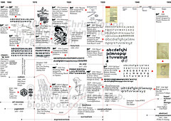
Type Timeline Map


type timeline half1
Originally uploaded by visual think map

This visual map explores the relationships/characteristics of the many different typographers/fonts, artistic movements from 1890 - 1950 charting each decade. Wanted it to be minimal style but vast in content, yet still clear and easy to follow.

It was inspired from Stefan Thermerson 'Kurt Schwitters on a time Chart' featured in the brilliant Typographica NS no. 14, December, 1966 edited by Herbert Spencer (Typographica by Rick Poynor 2001).

'...in which the practices and the techniques of typography have changed dramatically, in which technical developments have released typography from the restrictions and disciplines imposed by metal type, and allowed it to become increasingly visual and less linear, less linguistic. the frontiers between graphic design, photography, and typography have dissolved; the marriage of word and image has been consumated'

said by spencer, poynor pg 127.

Great summary of today and visualisations that we see, said in 1967, 41 years ago.

Sunday 18 May 2008

Life Map


LifeMap
Originally uploaded by ritwikdey


He charts his life between ages 6 and 24 with a revealing honesty of family. Great work looking at the self with the varying rainbow colours changing in scale on the top in these warm vibrant colours of his creative side each colour representing a discipline Drawing, Reading, Singing and further progressing in his Academic studies to Graphic Design, 3d modelling, then to MFA Advertising, Print, Ambient Music.

Then the subtle gradaution creating sublime salience of light blue to dark in the 'Non Academic' of Mechanics, Physics progressing to Code Art probably influenced by John Maeda no doubt, Info Viz.

The very bottom has a good reflection of life mentioning joining Boy Scouts, School Captain, Troop Leader, Mothers Illness, Relationships.

The Very Top if all this wasnt enough he has room to slip in more info of his geographic location over these years. But dont forget there is still room on the right to add to his life from now onwards...

Brilliant Multiple Subjective Map.

Thursday 15 May 2008

Snack on my Maps

Having seen quite a few internet visualisations such as that of the Information Architects - web trend map in a Harry Beck style seen a few times & Opte Project in these spider web constellation style, it was great to see a more graphic impression of it.

I know it was made in 2006 by the artist group Eboy, mentioned in Viz Think 08 post, but Foo Bar is great visual thinking. I first saw their excellant intricatly detailed environments in Illustration Now! although probably aware of that style in circa.

With Myspace street or Blogger as a subway system it uses these popular visuals of internet brands and interprets these into imaginative chaos happening in downtown, urban, industrial setting with physical locations. There are even physical items included such as Ipod's as well as yahoo looking like it is being packed away.

I'm quite curious as to what lost fm is playing from its van but I'd love to assume that the literal interpretation of RSS feeds is represented as a Snack Bar, or maybe deli.icio.us could be or as a advertisement for food. Would be a great visual for feeding.

Either way this illustration is great for eliciting creative visual thinking as a student soon discovered after they had picked eboy as a fave for analysis, scary word.

Tuesday 13 May 2008

Oxfam Tube Map


Final Piece
Originally uploaded by louise lynn

Visualising Oxfams work poster by louise lynn imitating the ever brilliant Beck Tube map. great idea, clean, colourful, like that there are no destinations, no limits to them. nice parchment, good design.

'This was the design chosen by Oxfam to use in their Liverpool Bold Street store. Will get a photo of that up soon when I get it off my Nan X).Displayed in exhibition 'A Window Into Oxfam' in Liverpool Central Library's Picton Room'.

More info here

www.flickr.com/photos/louiselynn/2476491473

Sunday 11 May 2008

Visually Identifying Zombies

The Common Craft Show is a series of short explanatory videos by Lee and Sachi LeFever. Our goal is to fight complexity with simple tools and plain language. We call our format "paperworks" and publish a new video about once a month.

Wonderful visual thinking accompanied by narrative. Zombies in plain english show the subtle humour of the plain english videos. there are ones for Blogs in plain english, RSS, Wikis, Social Networking, Online Photo Sharing. Brilliant.

Friday 9 May 2008

Visualising San Francisc-jello

These are brilliant ways of visualizing, mapping allowing us to see & percieve these regular topographic landmarks abstract luminous colours & organic shapes in a different light.

Liz Hickok's project for her Masters in Fine Art, they are part sculpture, part photography and video, it resonates beyond the immediate appeal of the rainbow colors to become a sublime form of landscape. Her version of the city, which stems from a long-standing interest in three-dimensional city maps, emits a different kind of luminosity than the late 19th century Hudson River Valley variety. This in particular Palace of Fine - C-PrintArts, 2006 12"x16" 36"x48"editions of 12 has a great opposite harmony of orange & blue when light is refracted through gelatin.

'I make the landscapes by constructing scale models of the architectural elements which I use to make molds. I then cast the buildings in Jell-O. Similar to making a movie set, I add backdrops, which I often paint, and elements such as mountains or trees, and then I dramatically light the scenes from the back or underneath. The Jell-O sculptures quickly decay, leaving the photographs and video as the remains' liz hickok.

The molds she construct herself are based on idealized postcard images and her own photographs – have a way of making her vision go down smoothly. When she makes her city shake, as in her short video work, the landscape comes alive with the power of nature and culture on the brink of transformation, through changing our perspectives of the world in quite an innovative way.


http://www.lizhickok.com/10palace.html#photo

http://www.mills.edu/academics/grants_and_special_programs/mfa_exhibitions/mfa_2005/hickock/

Originally Dugg by user Gregd here
http://digg.com/search?section=all&s=san+francisco+jello

Sunday 4 May 2008

Wireless Brain Mapping thoughts

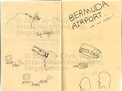
Love Muse, was first hooked with plug in baby, thought how it would be great if you could plug in. then took it a step further with pluging in wirelessly to download your thoughts, or upload.

Technology will be there one day... to boldy go where no one has gone before! Well... its there. What I imagined would be a great way to externalise thoughts, is almost a reality.

'Mapping brain could translate thoughts into speech

Forty-one neurons is a drop in the ocean compared with the hundred billion or so cells that are present in our brains. But those few neurons could help Eric Ramsey talk again. It is eight years since a car accident left Ramsey "locked-in" - aware but paralysed and unable to communicate other than through eye movements. By listening in on a tiny population of cells in his brain, neuroscientists hope to give him back his "voice" - a first for someone with his problems.

Ramsey had a wireless electrode implanted 6 millimetres or so below the surface of his brain in 2004 (see Diagram). The electrode records the electronic pulses sent by 41 neurons that surround it in an area of the brain involved in generating speech. By analysing the signals created when Ramsey imagines speaking, the team has developed software that may one day turn his thoughts into ...' from the New Scientist - access to full article needs subsciption.

PS if somone is subscribed could they send me the diagram featured in the article.

http://www.newscientist.com/channel/health/mg19626304.000-mapping-brain-cells-could-translate-thoughts-into-speech.html?feedId=health_rss20

Saturday 3 May 2008

Making of: Honda Problem Playground

With these ideas of communication skills, problem solving & drawing being essential qualities needed to visually think & design - solve, Viz Think 08, what a wonderful way to visualise problem solving than with the brimming creativity, innovation flowing from the pours of Honda advertising.


This is a great video about the making of, design of the Problem Playground.Honda commercials are about finding out real truth that the company loves problems. They wanted to visualise their thinking strategy which led them to problem playground.

The use of large scale puzzles was to serve as a metaphor that a problem needs solving, and the size for spectacle. It is human nature to enjoy a puzzle. With a little help from Speed cubist david calcvo and others Honda create another brillant ad.