excellant interactive way to browse through the projects with bestario's semantic search engine.
tags can be clicked at the bottom to present a new visual array very quickly
http://bestiario.org/research/remap/
mining: http://visualcomplexity.com
Wednesday, 30 September 2009

Friday, 18 September 2009
I wanna see the sun.... blotted out of the sky!

'The latest London Underground map issued by Transport for London is a cleaner, stripped down version of the previous one. But TfL has deemed it necessary to do away with one little aspect that, for many, is a key navigational part of the map. The river Thames...'

'When you compare the two, it's a bit of a mess isn't it? But why take the Thames out?
Ben Terrett emailed CR yesterday with news of the redesign and, on first inspection, the map looks decidedly less cluttered and is easier to read than earlier editions.
But is a river truly necessary on a map of a subterranean travel network anyway? Well, we're of the belief that, actually it is.'
I have to agree, when I saw this come in my inbox, I thought and.. until I spotted no river, that little bit of representing reality, albeit abstracted through simplification and Beck's 45 degree angling system to mimic what he did with the tube lines. It doesn't have to be Turgot's 1739 (french's long adoration to pure cartography - 100% true geography - right up until RAPT's 2000 Paris guide) style of from the air 3d view, i'm sure allowing just these little abstracted pure cartog examples of landmarks from the territory won't detract from the mapping's aid to navigation, but as the clever sparks at CR pointed out,
'It's (the thames) a key signifier of the true geography of the city and many journeys involve working out whether you're going north of south of the river (just ask a cabbie).'
Surely we should try to retain some level of reality in the mapping? some aspect of true geography, were not saying, like my tutor pointed out to me with a good humorous quote, we do 1:1 map, 1 inch to 1 inch,
'From Sylvie and Bruno Concluded
by Lewis Carroll, first published in 1893.
"That's another thing we've learned from your Nation," said Mein Herr,
"map-making. But we've carried it much further than you. What do you
consider the largest map that would be really useful?"
"About six inches to the mile."
""Only six inches!"exclaimed Mein Herr. "We very soon got to
six yards to the mile. Then we tried a hundred yards to the mile. And then came
the grandest idea of all! We actually made a map of the country,
on the scale of a mile to the
mile!"
"Have you used it much?" I enquired.
"It has never been spread out, yet," said Mein Herr: "the farmers
objected: they said it would cover the whole country, and shut out the sunlight!
So we now use the country itself, as its own map, and I assure
you it does nearly as well.
Were not saying shut out the sunlight ;o), but no need to to go to the other extreme like this new london underground map and make that many simplifcations, drilling down the data so far that we remove any representation of geography whatsoever, stick with what we had, KEEP THE THAMES. Stay on a par with the French, as they managed to adopt a higher level of abstraction and simplification, away from Turgot, but kept their river... erm... sienne i think.
And personally, when I made a rare venture a abroad (I know it wasn't that far, a channel tunnel abroad ;o) ), I used the map below with iconic depictions of the opera house, the eiffel tower, the museums (typical artist/designer) i was trying to combine this with the subway map, cross referencing the stations and geographic proximity to that of stations to get around. Therefore I think ever so slight spatial allowances for typical landmarks in the topographic landscape such as Big Ben, Guerkin, Tate should be depicted or at least encoded somehow to aid us non-residents.
Telling the whole story and blocking out the sunlight is obviously not that much of an aid, although funny, nor therefore then a map, showing the whole territory rather than aiding with simplification through 'making selections' on reality.
But likewise complete abstraction such as this new underground map removing
any geographic depiction, 0% pure cartography, an aid, removing the river is
just as well serving to block out the sunlight (our level of understanding and
patience) as does the other end.
WE NEED SOME ASPECT OF PURE CARTOGRAPHY DEPICTING
Find a balance (as there was already btw....... if it isn't broke....)
80% abstraction & 20% pure cartography (albeit that this 20% might well have a level of simplification also such as iconicising - - I know I prob made-up a word, but lets push the lexicon ;o) - - )
I know as a designer we have to challenge the stat quo and push our perceptions and representations but I'm sure there is a far too high a level of perception required to realise where your are without some geography in this type of representation - mapping info! It does look cleaner, with i think more white space, but put some pure cartog in there... please.
Let us SEE THE SUNLIGHT
http://creativereview.co.uk/cr-blog/2009/september/tube-map
No sooner (behind by a couple of days) do I post, than I find from Jonathon Crowe at the map room usually the person with the most up-to-the-minute news on mapping btw, is the plea to Let us SEE THE SUNLIGHT is answered....
btw... I avoided mentioning about the fare zones, but I felt aggrieved at the elimination of the zones myself also (not a londoner) as I do appreciate being able to determine costs / travel criteria.
-------------------------------------------
ps dont paint it black... love the stones... btw dont you always notice how films always use this song along side representing evil on goings... full metal jacket at the end i think, devils advocate... and i'm sure there were others.
Thursday, 17 September 2009
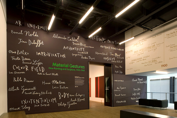
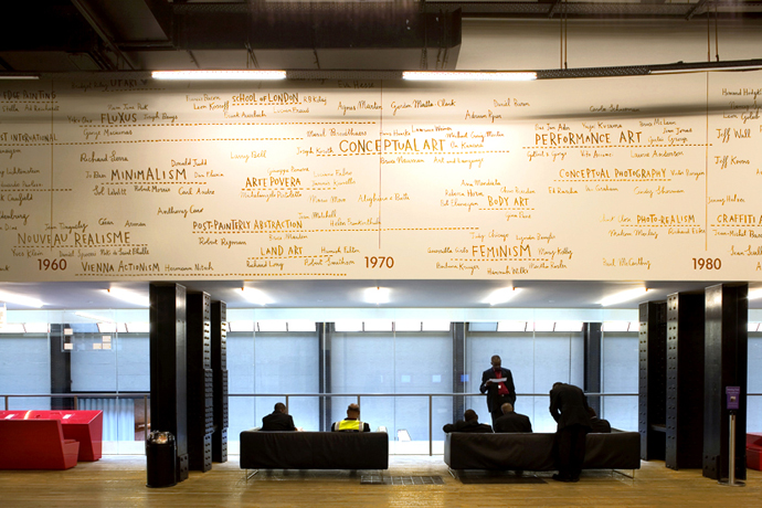
art timeline tate by sara fanelli1
really nice handwritten style
http://sarafanelli.com/docs/bg03.html
purchasable as a concertina square booklet.
she also has collaborated on a book with steven heller and m. warner that sounds very interesting (well to me) 'Sometimes i think, sometimes i am'.

http://sarafanelli.com/docs/bg03.html
purchasable as a concertina square booklet.
she also has collaborated on a book with steven heller and m. warner that sounds very interesting (well to me) 'Sometimes i think, sometimes i am'.

Wednesday, 16 September 2009
Online Visual DNA strand
determine your online dna strand as it were. lovely real time data mining of the web for your search term like your name, alias, site name.
http://personas.media.mit.edu/personasWeb.html

http://personas.media.mit.edu/personasWeb.html
Sunday, 13 September 2009
250 best movies of all time map by david honnorat
again a popular method of resorting to the underground map. interestingly the creator has changed the 45 degree angling of lines by harry beck, only in a few places though. otherwise keeping to beck's form.
from:
dataviz.tumblr.com/post/183379608
tumblr link found through:
http://www.smashingmagazine.com/2009/09/11/25-useful-data-visualization-and-infographics-resources/

from:
dataviz.tumblr.com/post/183379608
tumblr link found through:
http://www.smashingmagazine.com/2009/09/11/25-useful-data-visualization-and-infographics-resources/
Saturday, 12 September 2009
CS 171 Visualization 2008
I was shared this link on Del.ici.ous sorry cant remember by whom. It is the Havard school of engineering and applied sciences course, very inetersting.
Topics: (subject to change)
Data and Image Models
Visual Perception & Cognitive Principles
Color Encoding
Visualization Software Design
Designing 2D Graphs
Maps & Google Earth
Higher-dimensional Data
Unstructured Text and Document Collections
Trees and Networks
Scientific Visualization
Medical Visualization
Scientific Photography
Animation
Interaction Techniques
Social Visualization
Visualization & The Arts
Well I liked perusing the students visualisation projects below:
Abraham Passaglia
Baseball Player Value Indicators
Alex Chou
Visualization of Piano Music
Andrew Granoff
Hasty Pudding Ticket Sales Visualizer
Wen Huang Wang
Visualization of US Metropolitan House Market
Andrei Munteanu, Anjuli Kannan
Visualizing Synonym Chains
Bill Wright
2D Color Load Meter for Visualizing Annual HVAC Loads
Brett Thomas, Clara Blattler
Energy Success Rate: Re-evaluating Energy Efficiency
Wendy Bossons, Melanie Howell, and Tawa Taylor
Hurricane Katrina After Effects
Cindy Cheng
Visualizing Vocabulary
Daniel Carroll, Tyler Bosmeny
Visualizing Trends in Search Data Subsets
Daniel J. Hilferty
Visualizing the National Budget
Daniel Suo
Emily Dickinson Revisited
David Kosslyn, Rajaraman Sundaram
Visually Del.icio.us
David Reshef
Vibrio Cholera Computational and Graphical Database
David Ng
NBA Player and Team Performance Trends
Derek Horton
HyperVisualizer: Visualizing Virtual Machines
Diana MacLean
Crime and Perceptions of Crime in Boston
Katie Fifer, Doug Lloyd
Visualizing the US's Subprime Mortgage Crisis and its Effects on the Economy
Douglas Alan
An Interactive Tool for Exploring Dendrogram Representations of Spectral Line Data Cubes
Eric Gieseke
Where and what are the current hazardous threats?
Gregory Gimler, Trung Tran
Natural Disasters Around The World
Peter V. Henstock
Understanding the Sequence of Learning Japanese Kanji
J.R. Hass
Visualizing Related Images Using The Image Gist Algorithm
Jesse Fish
A Visual Analysis of Movies, Actors and Actresses Using IMDB
Jesse Rader, Samir Paul
Harvard by the Numbers
Jonathan Tsao
Wikivisia: A Graph Visualization of Articles in Wikipedia
Jue Wang, Giancarlo Garcia
Where's the Music? (Concert Locations Visualization)
Karen Feng
LinkTracr: tracing links through the blogosphere
Katie Grosteffon
Nursing Home Care
Elizabeth Lemon
Book sharing patterns among users of BookCrossing.com
Nick Chammas, Mark Garro
Visualizing a Machine's Thought-Process (Game Analysis with a Min-Max/Alpha-Beta Search Engine)
Mark Yetter
South Korea's Age Income Landscape in a World of Change
Matthew Huchu, Lilli Gilligan
Thermal Engineering plc: Departmental Performance Noticeboard
Hao-Yuh Su
Music Trend Visualization
Penelope Cuevas
Healthcare Costs
Qing Gao
Mining Audioscrobbler
Roanna Ruiz
Visualizing the Normal and Post-Stroke Brain
Savita Sahgal
Visualizing SUV attributes to make a better buying decision
Silpa Kovvali, Teddy Sherrill
Economics and Performance in the National Basketball Association
Steven Vasilakos
Effective Dashboard Design
Tara Murphy-Volz
State Relocation Assistant
Thomas Carriero, Jie Tang
Visualizing My Inbox
Thomas Wionzek
50 Years of the Dollar: Currency Strength Animated Timeline
Tina Tang
Visualizing Academic Networks
Timothy Knell
Visualizing Sarah Jane Studios
Victor Lan
Top news stories for the day?
William Cheng
Visualization of Extrasolar Planetary Systems
shame some links dont work.
well ofund here, with the course details as well. http://www.seas.harvard.edu/courses/cs171/
Thursday, 10 September 2009
supergraphic v1 by Maitri Erwin
how to make a 'super' data visualisation done during a lecture from ET (he apparently likes this, its not me setting it up) Edward Tufte.
visit the link below for 10 minute audio interview with ET ;o)
found: http://www.vizworld.com/2009/09/an-interview-with-edward-tufte/?utm_campaign=awesm&utm_medium=awe.sm-twitter&utm_source=twitter.com&utm_content=sociable-wordpress

visit the link below for 10 minute audio interview with ET ;o)
found: http://www.vizworld.com/2009/09/an-interview-with-edward-tufte/?utm_campaign=awesm&utm_medium=awe.sm-twitter&utm_source=twitter.com&utm_content=sociable-wordpress
Wednesday, 9 September 2009
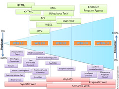
web 1.0 to web 2.0, web 3.0 and a head!
Was always curious as to what constituted web 2.0 as i was aware it was about feeds, rss and blogs but this diagram has broken it down much more helpfully.
Monday, 7 September 2009
Western Philosophy History Map
'This is a project that I have been working on for about a year now. It all began as part of my personal quest to reach an understanding of and a justification for my set of personal moral and ethical beliefs. In order to help me work out some of my own ideas, I decided to work my way through the 84-part lecture series offered by Teach 21 titled " Great Minds of the Western Intellectual Tradition, 3rd Edition". The course is an amazing journey, starting with Plato and working its way through to the modern era. ' jason b.
It is a very detailed map and well worth a look.
http://blog.buberel.org/2009/07/a-visual-map-of-the-history-of-western-philosophy.html
cheers jay d.
Wednesday, 2 September 2009
In-Flowing

Merging different graphs such as trees, flows, line looks good.


See this fantastic site about sankey diagrams, http://www.sankey-diagrams.com/
Sankey diagrams are a specific type of flow diagram, in which the width of
the arrows is shown proportionally to the flow quantity. They are typically
used to visualize energy or material transfers between processes.
Source: Wikipedia, article Sankey Diagram
Media Map by brian holmes

Similiar to this previous post,

Some pages from Willard Cope Brinton's second book
(1939). The whole book can be downloaded (in a worse resolution) for free from www.archive.org/details/graphicpresentat00brinrich
Is also like this merging many types of representations together. http://telegeography.com/products/map_traffic/index.phpe
Global Internet Map

Subscribe to:
Posts (Atom)