Showing posts sorted by relevance for query circles. Sort by date Show all posts

Sunday, 4 October 2009

Self Publishing Visualisation

Self Publishing Visualisation by chris watson

I made this visualisation to help me decide which was the best service to use to self publish visualisation magazine.com which I blogged about its online presence visualisation magazine vol 2 circles.

As I was informed by a member on LinkedIn of Mag Cloud possibly being able to help realise my magazine in print it made me aware of POD (Print-on-demand), which allowed me to discover the many services from Lulu.com to CreateSpace.com (amazon). These 2 were the most well known and used.

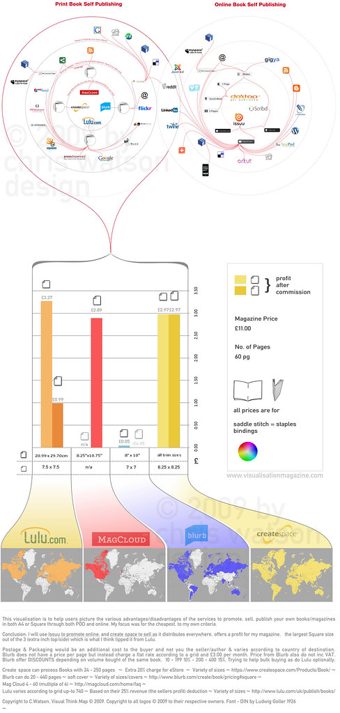
So to compare the 4 services that seemed to be the most prominent MagCloud, CreateSpace, Lulu & Blurb (may have seen linked with Flickr) I wanted to compare:
  • How they allow online promotion
  • Where the service delivers to in the world (didnt want to narrow my market)
  • Their profit margins after their production costs for both SQUARE (8.25 x 8.25 varies) & A4
  • The services that allow online publishing
Well, the circles at the top I loved the connotation that the circles provide a target area similiar to ground zero and the red lines are infecting spreading accross the web. This gives the impression of an area's density of colour (red) linking from the particular service, an easy to percieve visual instantiation.

I could have added more lines springing from services such as addthis, sharethis, gigya or even RSS feeds but I thought it would be too many levels.

Apart from line crossings of red over the grey circles, their are no red lines crossings (minimise the number of edge crossings), which was quite the challebge re-arranging and technically using bezier curves.

The bar chart I kept lines for money scales so it is easier to compare and decide where the bars reach. I didnt want to go into too many more levels of money as the bar would be extremely long and out of proportion with the rest of the design such as the circles and the maps. So this is why I provided the actual amounts above the end of the bar. I also added the Square paper icons and A4 icons, and faded one if it was a loss or not provided by the site. Lastly I lightened the bars to again help differentiate between A4 service or Square.

I had a box to the right of the bar just to show my specifications of full colour, saddle stitch (stapled), I had set up an Excel file (http://tinyurl.com/SelfPublishVisualisationData, a google spreadsheet doc) with to calculate my profits/loss etc for how many 'pages' and 'price' variables to change (it did end up more pages then 60), and the colour key. Below the bars is the spec's sizes for each service as they are slight variations.

These specs's sizes then lead off to graduations of white to the individual colours and the company/sites logos, brands. I widened them so that my world maps were not too small where i used a basic colour fill of the individual countries the service delivers to. I didnt again want to make them too big and out of proportion to the rest of the design, if you download it I'ver kept enough resolution quality so you can zoom in and see the indiviudally labelled countries on the maps to see if they are colour filled to to see if they deliver there.

This data mining of the countries they deliver to and the time of filling in the colour over eeach country was a time concsuming activity.

Well, I am pleased with it as it was a challenge researching, finding data, I did the three sections individually and managed to bring them together ok. Do like the gradients of colour to the world maps, makes it a little more aesthetically pleasing but still functional and the viral look of the circles infecting different levels and depths of the web, really nice visual rhetoric.

Volume 2 Circles See who is featured Purchase a copy on Amazon


.


.


Click thumbnail for larger image.


Please share your opinions, comments. I will post a making of / how to make your own mag post soon.

All sites and useful self publishing links.

Comparisons and How to make your book/magazine sites


http://www.mequoda.com/articles/online-publishing/which-online-self-publishing-site-is-right-for-you/
- excellent post that collates online self publishing sites and their advantages / disadvantages


http://www.bitwisemag.com/2/Publish-And-Be-Damned
- excellent post telling you details about some of the sites mentioned above but also going to great depth telling you how you can make your book magazine such as software to use with Quark express or Adobe InDesign, what settings, resolution etc. also see my making of... http://visualisationmagazine.com/making.htm


http://www.lugaru.com/lulucalc.html
- Compare Lulu.com with CreateSpace (amazon) and calculate your costs of the type and style of book/magazine you desire (little out of date but still useful).


Useful Sites


http://www.royalmail.com/portal/rm/content1?catId=400036&mediaId=53800712
- calculate UK postage costs


http://www.xe.com/ucc/convert.cgi
- convert your $ prices to euro, £.


POD Publishing Sites


http://www.lulu.com/ - think they are UK based.


https://www.createspace.com/Products/Book/ - US based. mickrooney.blogspot.com createspace reviewed very thorough and vast blog on POD sites/services


http://www.blurb.com/ - you may have seen them affiliated through Flickr.


http://magcloud.com/ - US based.


https://www.lightningsource.com/ - UK based.


Online Publishing Sites


http://www.doxtop.com/


http://issuu.com/ - I chose these as they let me publish documents privately (not seen by google) so that I can customise the embed viewer (remove print button).


http://www.scribd.com/


http://www.slideshare.net/ - not so much book/magazine style but still provides a good embed viewer - more for powerpoints/presentational documents.

Friday, 6 March 2009

Visualisation Magazine Volume 2 - Circles


this magazine collates some of the most creative and innovative visualisation of information that try to simplify the complex. this volume is based around circles.

http://issuu.com/visualthinkmap/docs/visualisation_volume_2_circles
featured at flickr:


http://www.flickr.com/photos/visualthinkmap/3333627301/


or on you tube:


http://www.youtube.com/watch?v=qPo8BJcsEXw&eurl=http://business-commando.com/business_commando/&feature=player_embedded


next is based on isometrics. example layout featuring work by julienbayle.net


With excellant help and collaboration from pedro montiero at whattype.wordpress.com it has had an excellant revamp. More work featured by,


Carl Tashian
Peter Crnokrak
T D Architects: Theo Deutinger, Johannes Pointl, Beatriz Ramo
Bradford Paley
Quentin Delobel
Andrew Collins
Grace Lee
Wesley Grubbs, Nick Yahnke
Julien Bayle
Pedro Montiero
Roaxanna Tran (at telegeography.com plus other members)
Ji-Hwan Kim
Sol Jin
stephen p anderson
Christian Nold
jess bachman
tom gauld
2spot et al
Nick Cawthon
Andrew Vande Moere
Jarke J. van Wijk

please send your examples of isometrics for the future issue 3. also please give feedback. and observe the copyrights of non commercial, no derivatives, attributation to myself and pedro.


all featured are very good resources of inspiration for various design jobs as they solve communication problems using easy to understand graphics. Seems a mouthful but basically great graphics that look great (form) and communicate detailed info quickly and easily (function).


All items featured at http://visualthinkmap.ning.com


Version 1 here:

Visualisation Magazine vol 1 by visual think map

This layout of version 2 lets you zoom in more but loses the nice double page spread, incase you want to see closer detail.


thanks again to all who contributed and there cooperation, very helpful allowing their work to be featured in the magazine and others advice and help. thanks to pedro's collaboartion too, gave it a really good revamp. see more of my work at

http://chriswatsondesign.viviti.com/


or more visualisations featured at


http://visualthinkmap.ning.com

Monday, 22 June 2009

Olympic Infographic

i saw it tweeted from new follower/following http://twitter.com/infojocks/status/2225853051

great use of colour, clean, clear much in the vain of Global Internet Map by roxanna tran and telegeography.com

apologises i dont know more about the author, will ask jeremy (infojocks) more about who made it. might be at the bottom of the infographic.

See more circles, here:

http://visualthinkmap.blogspot.com/search?q=circles

Thursday, 11 June 2009

UNSCR


unsc - pierozagami

'UNSC/R: this is the abbreviation for the United Nations Security Council
Resolutions.

These documents represent the decisions of the UN’s executive body. This
massiveamount of data (more than 1700 documents) doesn’t come in any organized form.

The purpose of this project is to apply information design strategies to create
visual maps of the Resolutions to help students in politics approach the subject of the
UN.

For more information about this project please visit my blog.'

This is is an interesting project and useful, need to knwo more info as to
how the circles help index, communicate, structure the info.

from here: http://www.pierozagami.com/index.php?/test-1/unscr/

many more shots of this visual there.

Wednesday, 10 December 2008

Global Internet Map

global internet map - telegeography.com


They've made another. love the circles. and connecting lines.

TeleGeography‘s new Global Internet Map draws upon our annual Global Internet Geography research to provide a unique view of the international Internet networks that link the globe.


The map‘s global projection traces the intercontinental links between the countries of Europe, Asia, North and Latin America, and Africa. Regional close-ups provide insight into key routes within each region. Nine accompanying figures and tables present valuable data on Internet bandwidth by country, regional and global Internet capacity growth, backbone providers, traffic by application, wholesale pricing, and broadband user growth.


The Big Picture


The global projection depicts intercontinental Internet links between the countries of Europe, Asia, North and Latin America, and Africa. higher res (larger) here:

1280x800
1440x900


Their links lines are similiar to those in key magazine cover by John Maeda & world flow.


Find out more: http://visualthinkmap.ning.com/photo/global-internet-map


Their previous internet visuals:


Internet Undersea Map


Other internet visualisations:


Foo Bar - Eboy


Web Trend Map 2008 Beta - Information Architects


Domain Name Map - Hugh Dubberly


Opte Project

Also check out:

Circular Visuals

Monday, 16 March 2009

Mapping Genes

Mapping the Human 'Diseasome' by Marc Vidal; Albert-Laszlo Barabasi; Michael Cusick

really like this, clean simplification of a complex subject showing the amount of genes associated with that disease. Researchers created a map linking different diseases, represented by circles, to the genes they have in common, represented by squares. Related Article: Redefining Disease, Genes and All

love the size ratio and soft pastels colours.


Tuesday, 29 April 2008

Dynamic Time Visualisation


Julien Bayle.net talks about visual design and more. He works on social network visualizations, generative art and data visualizations.

He has had some of his social network visualisations published on visual complexity.com.

His dynamic clock to visualise time is simple and innovative. Rather than just static numbers around a circle and handles, he uses space (area) in circles to represent the amount of time elapsed in seconds (dark blue), minutes (white) & hours (light blue).

A great alternative perspective to time rather than the usual. Certainly making the familiar strange through a conflict that needs to be interpreted.


http://www.julienbayle.net/complexity/visualization/clock/

Monday, 24 March 2008

Music Plasma


Its ‘planets’ style with the 3D central gradient effect to the circles, and varying sizes create excellent salience as they grab your attention. The circular halo around ‘a band represents its popularity, the wider it is, the more popular or representative of a certain style of music it is’. The colour stands out against the soft grey background, ‘the colour of a very popular band, will influence the colour of the related bands’ (Worldwide, 2005, p. credits).

This varying size affects the information value very effectively, but as it is a Concept map, clicking one of the planets readjusts the circular halo (planets) to a series of bands that are associated to them, such as with The Ravonettes. The subtle, seamless, beautiful real time repositioning of the constellation to the associated bands with them is excellent. The interconnection of these information sources is immense and is not half, not nearly as visually stimulating viewed via plain words/sentences. Music Plasma has an interactive highly creative visual composition, visual map. It has mapped the knowledge of a map designers mind and allowed the seamless fluid motion to map user’s interaction.
Worldwide copyright.com (2005). Frederic Vavrille – Live Plasma
http://www.musicplasma.com/