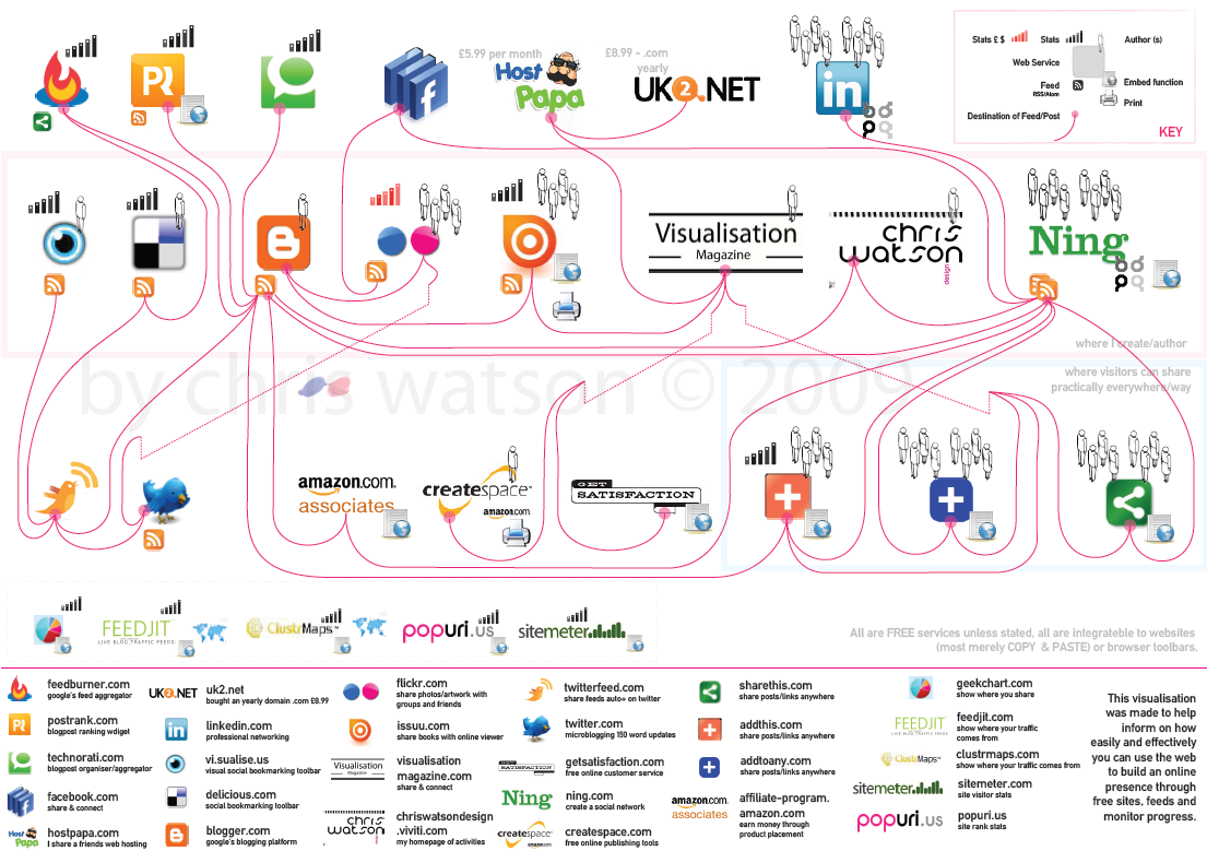
There are more that I have started to use and need to integrate at some point
(they were just embeddable widgets).
![]()
feedburner.com
google’s feed aggregator, splice in Del.ici.ous links or amazon and ping your blog posts to different services![]()
postrank.com
blogpost ranking widget, show readers your popular posts![]()
technorati.com
blogpost organiser/aggregator pinging and rating among your categories of blogs.![]()
facebook.com
share & connect![]()
hostpapa.com (not free, but cheap and can host many sites)
I share a friends web hosting![]()
uk2.net (not free, but cheap and easy to integrate with hostpapa)
bought an yearly domain .com £8.99![]()
linkedin.com
professional networking, set up your own groups![]()
vi.sualise.us
visual social bookmarking toolbar![]()
delicious.com
social bookmarking toolbar![]()
blogger.com
google’s blogging platform![]()
flickr.com
share photos/artwork with groups and friends![]()
visualisationmagazine.com
my website for my data visualisation magazine free to see online (using issuu, search it in my blog posts)![]()

chriswatsondesign.viviti.com
my homepage of activities, viviti lets you build a basic website to promote if you dont have your own host or dont want to learn html etc.![]()
issuu.com
share books with an online viewer either public or private (still embeddable, private is little more awkward to implement, see http://visualthinkmap.blogspot.com/2009/10/self-publishing-visualisation.html)![]()
twitterfeed.com
share feeds auto on twitter, your blog, your del.ici.ous, vi.sualise.us, flickr (anywhere with a feed)![]()
twitter.com
microblogging 150 word updates![]()
getsatisfaction.com
free online customer services, embeddable widgets and brandable with your own header etc.![]()
ning.com
create a social network and add pictures, website links, blog posts, videos, linked to flickr, you tube.... very good. add html data.![]()
createspace.com
free online publishing tools, books, cds, video![]()
affiliate-program.amazon.com
earn money through product placement
![]()
sharethis.com
share posts/links anywhere, such s twitter all those services, whatever you use, tumblur, stumble upon its listed.
![]()
addthis.com
share posts/links anywhere as like share this.
![]()
addtoany.com
share posts/links anywhere as like share this.![]()
geekchart.com
show where you share, more novelty but interesting nonetheless for visitors wanting to know where to follow you best.![]()
feedjit.com
show where your traffic comes from in the world.![]()
clustrmaps.com
show where your traffic comes from in the world.![]()
sitemeter.com
site visitor stats
goingup.com (not signed up yet, but looks good)
earn money through stats![]()
popuri.us
site rank stats, where are you on google page rank, alexa, yahoo back links etc.
e-zeeinternet.com
free embeddable counter, no subscribing/details needed. just your url of where its going.
this was a great post, many that i need to have a look at and probably use,
desizntech.info/2009/10/22-really-useful-online-tools-for-web-designers-and-bloggers/
If you know of any more really useful and excellent sites/services that are free on the web please let me know.
Design
It was quite a challenge, I wanted to avoid the amount of edge crossings with the lines. This isn't that easy as you can imagine to avoid the amount of edge crossings, if there are too many like in the diagram below it can reduce the readability mentioned upon by Lau & Vande Moere.pdf, pg 1 (infosthetics.com) and referred too as Good Continuity in the Gestalt Laws of Perception for effective visual communication in Cartographic Design: Theoretical and Practical Perspectives, from John Wiley & Sons Inc.
So I had to re-arrange the different sites quite a few times as it is quite easy to make them all integrate, such as rss/atom feeds directly being fed to different sites, or being able to embed items into blogger, websites etc. As you would expect from today's web 2.0, you want them all spidering each other and linked and easily integratable with each other it generates a lot of lines (not that easy to distinguish which sites can link, embed with each other). I thought about using colour to differentiate between embed links and rss links.
I think there are 13 edge crossings (making it look like spaghetti and hard to follow, causing conflicts and burdening cognitive load and reducing readability and ease of engagement as you interact with it, inevitably giving up with it, 'oh **** that!'). That 13 is a high number, trust me it could have been worse, but i try to get round that by giving a perception of depth and differentiating line quality so that they arent the same and the eye can still maintain good continuation, as Gestalt say, for the reader and the designs readbalility (think there is a test that scores the readability of text, see Hrant Paparazin 'Improving the tool' in Graphic Design and Reading: exploring an un-easy relationship by gunnar swansson.
I help when they come to going along the differentiated dashed line from Visualisation Magazine or Flickr that I added a depth too by also adding rigid straight lines contrasting the flowing curved solid lines (lots of contrasts to differentiate).
I also straightened the lines making them parallel such as to the left hand side of Blogger (orange b), Or underneath Blogger connecting to Ning. Helps with the Common Fate (Gestalt) and again easier to follow the individual lines. Simliar to TeleGeography with their parallel lines springing from countries.
Below are links to Picassa. Please observe image copyrights to their owners. Use these to have ago your self at creating a web 2.0


No comments:
Post a Comment